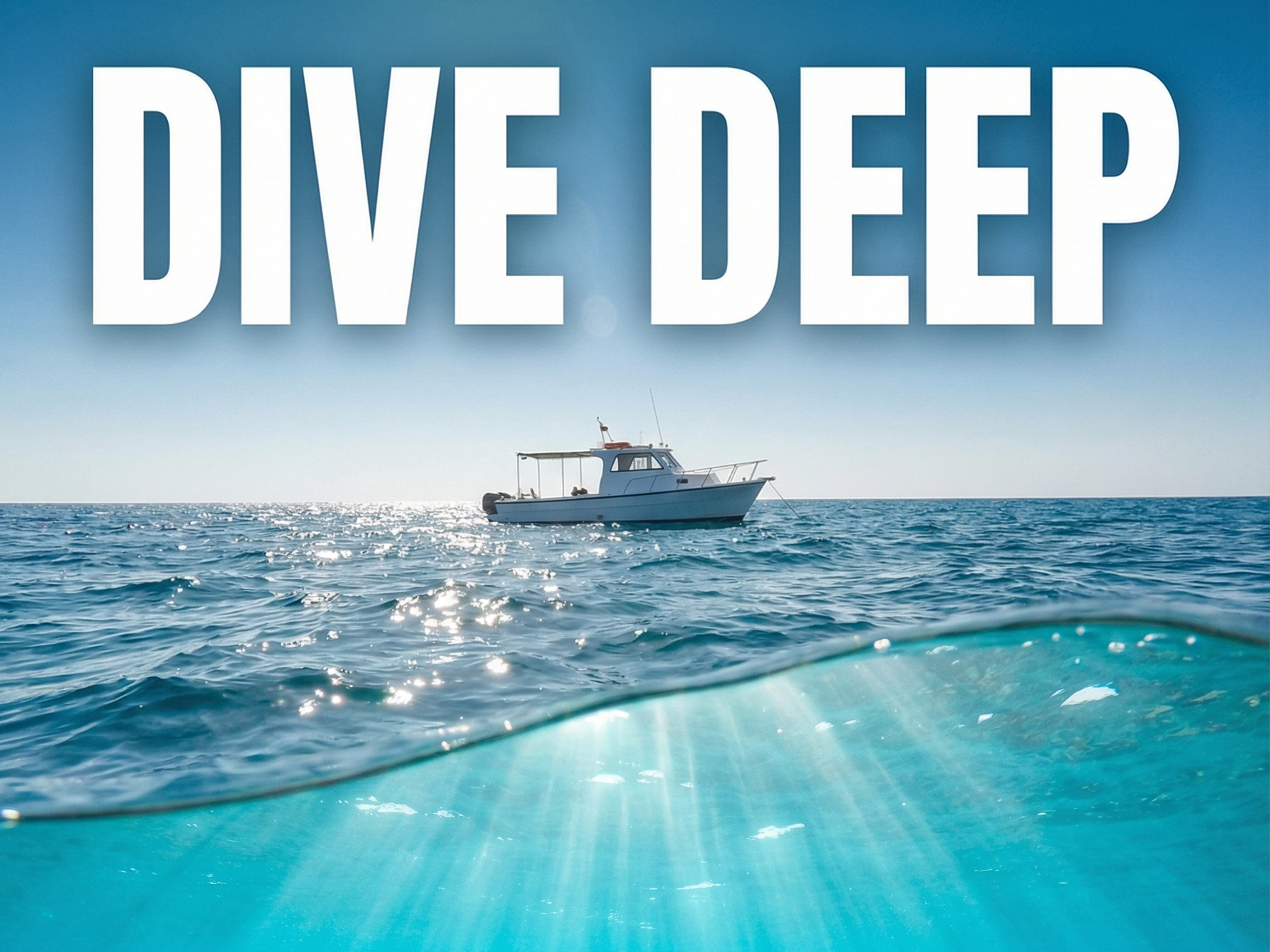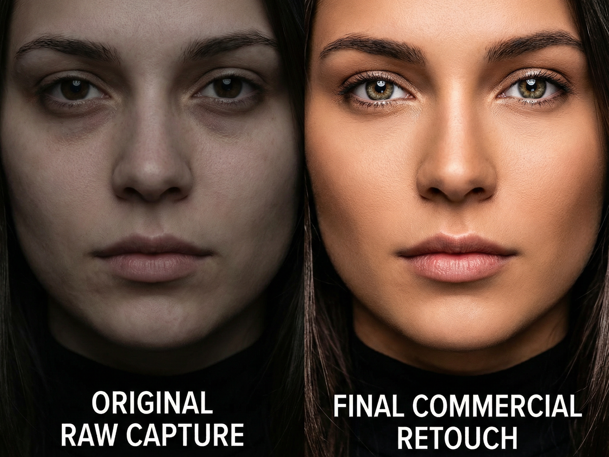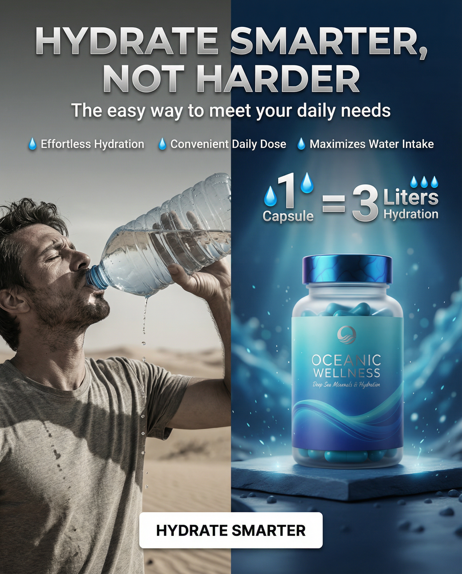
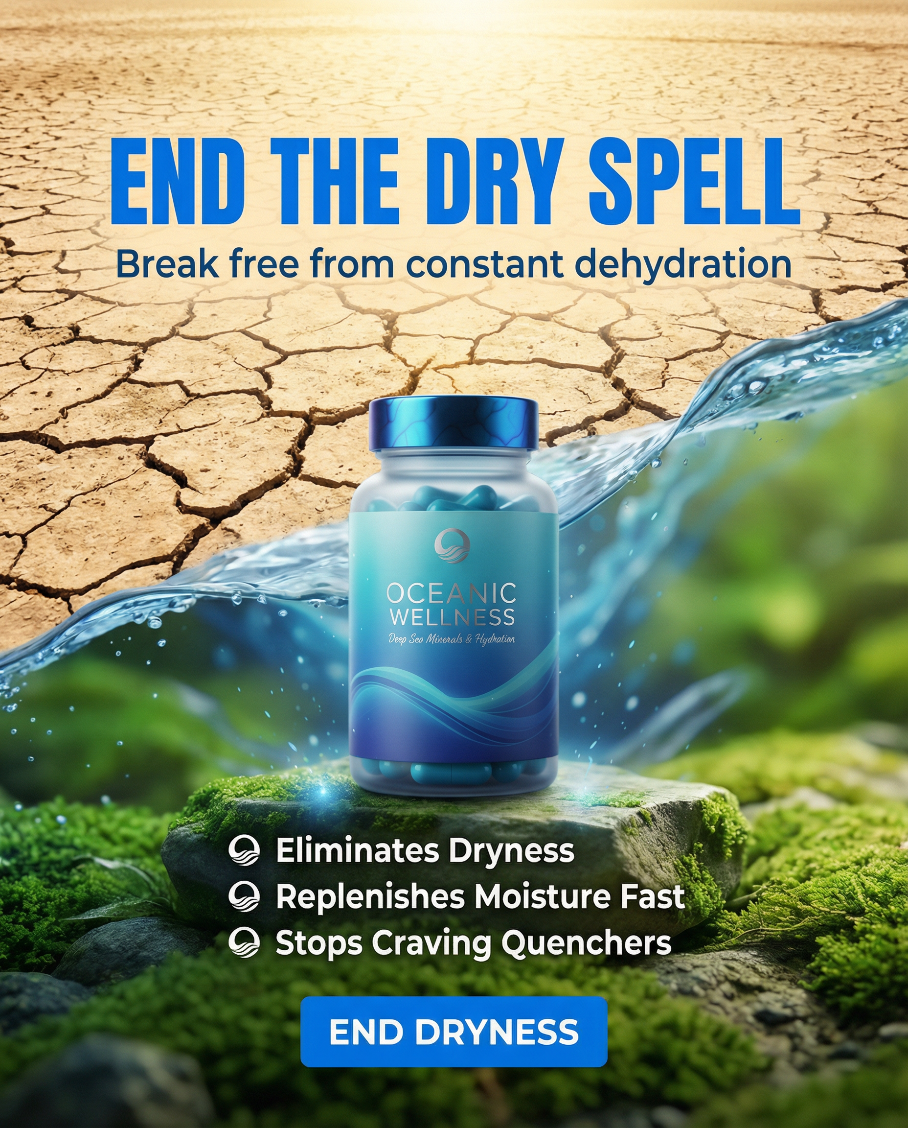
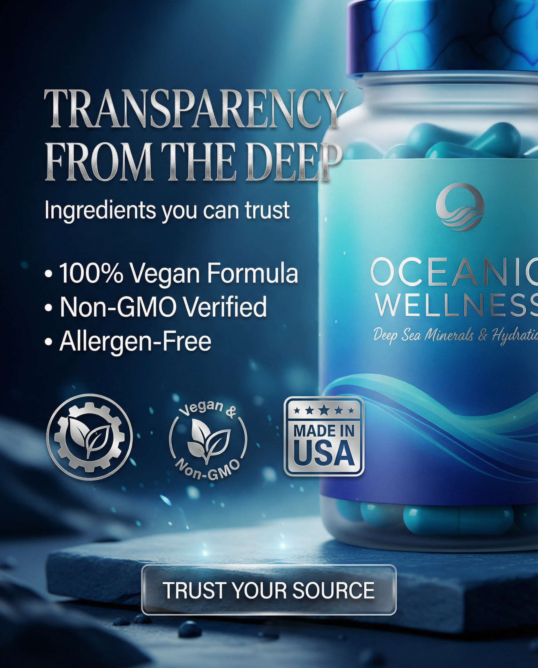
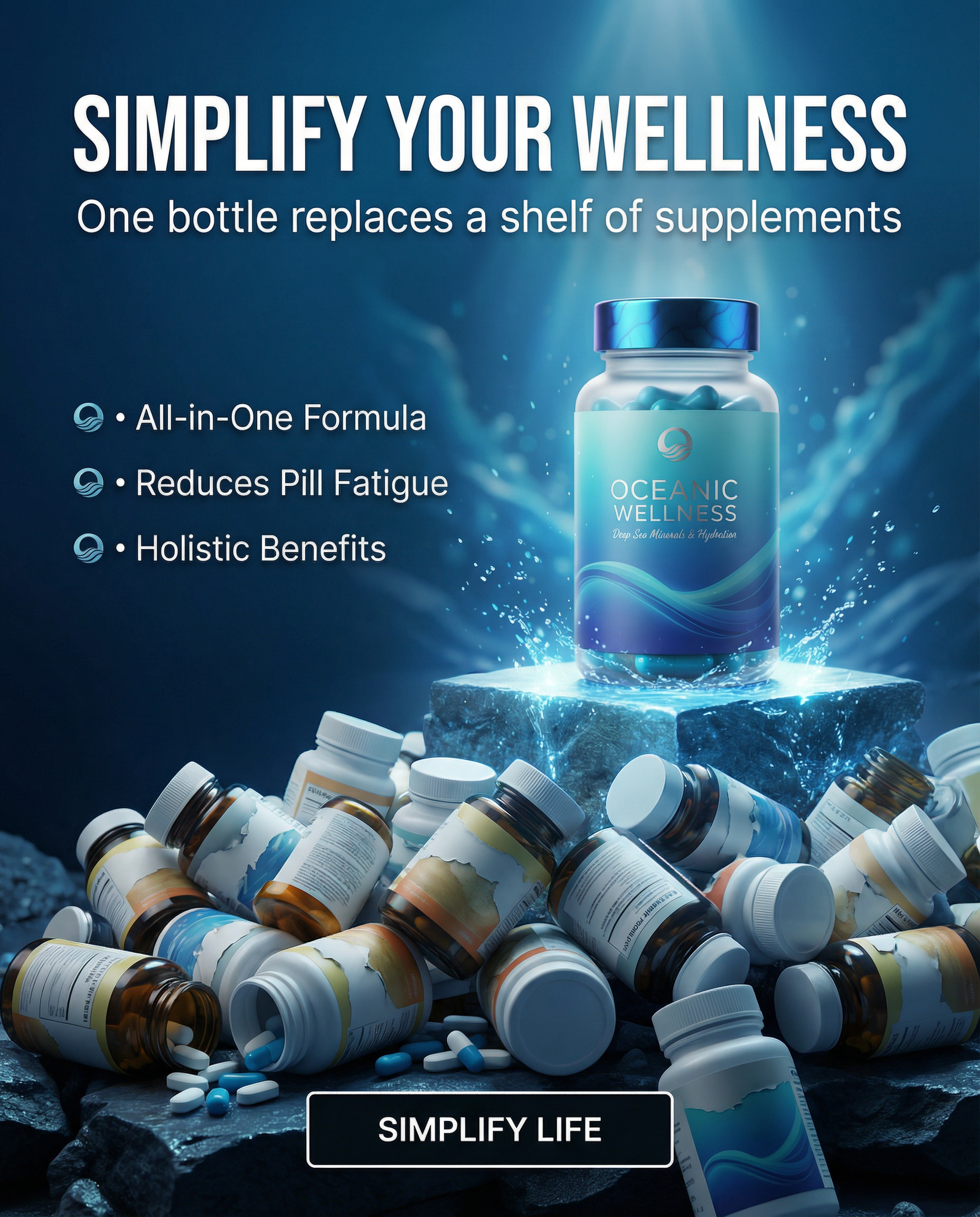
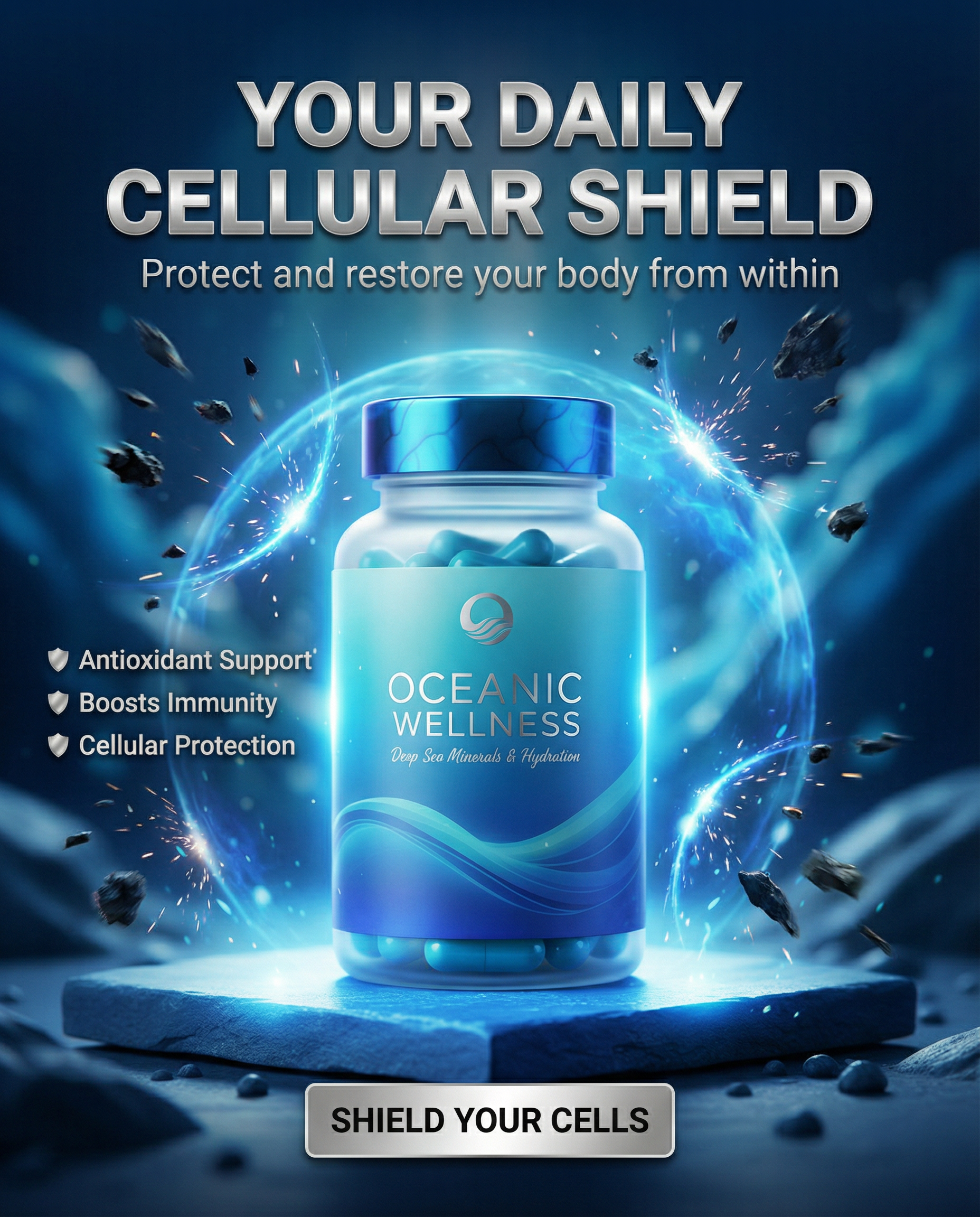
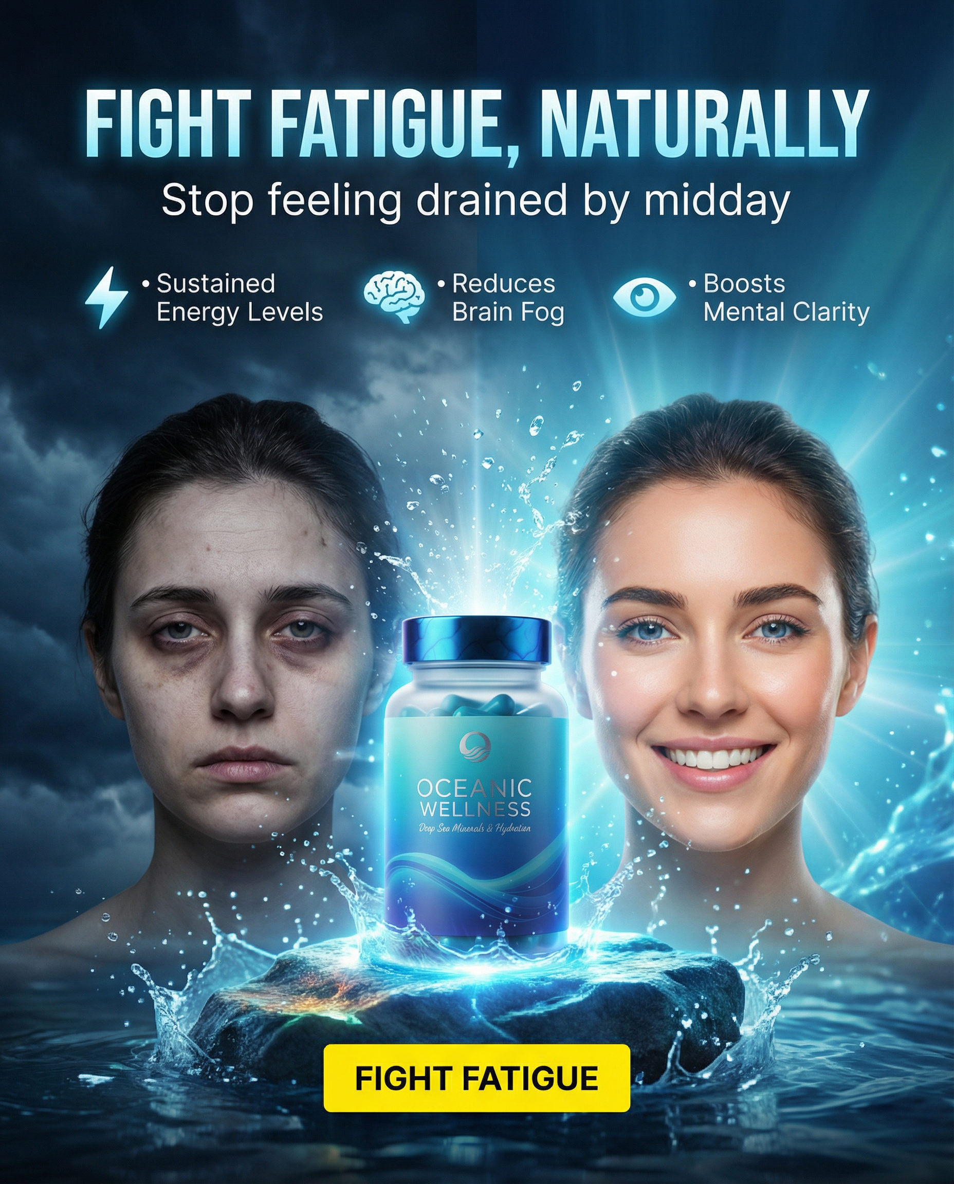
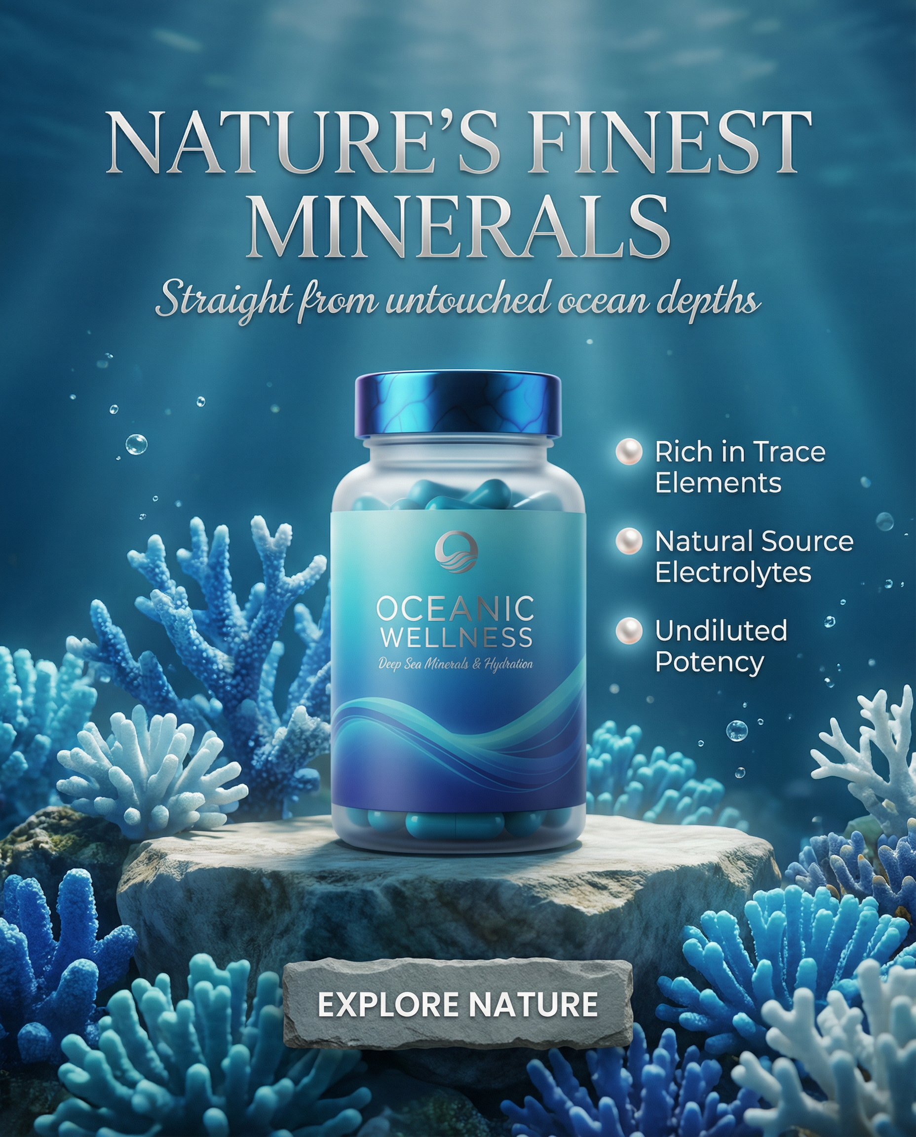
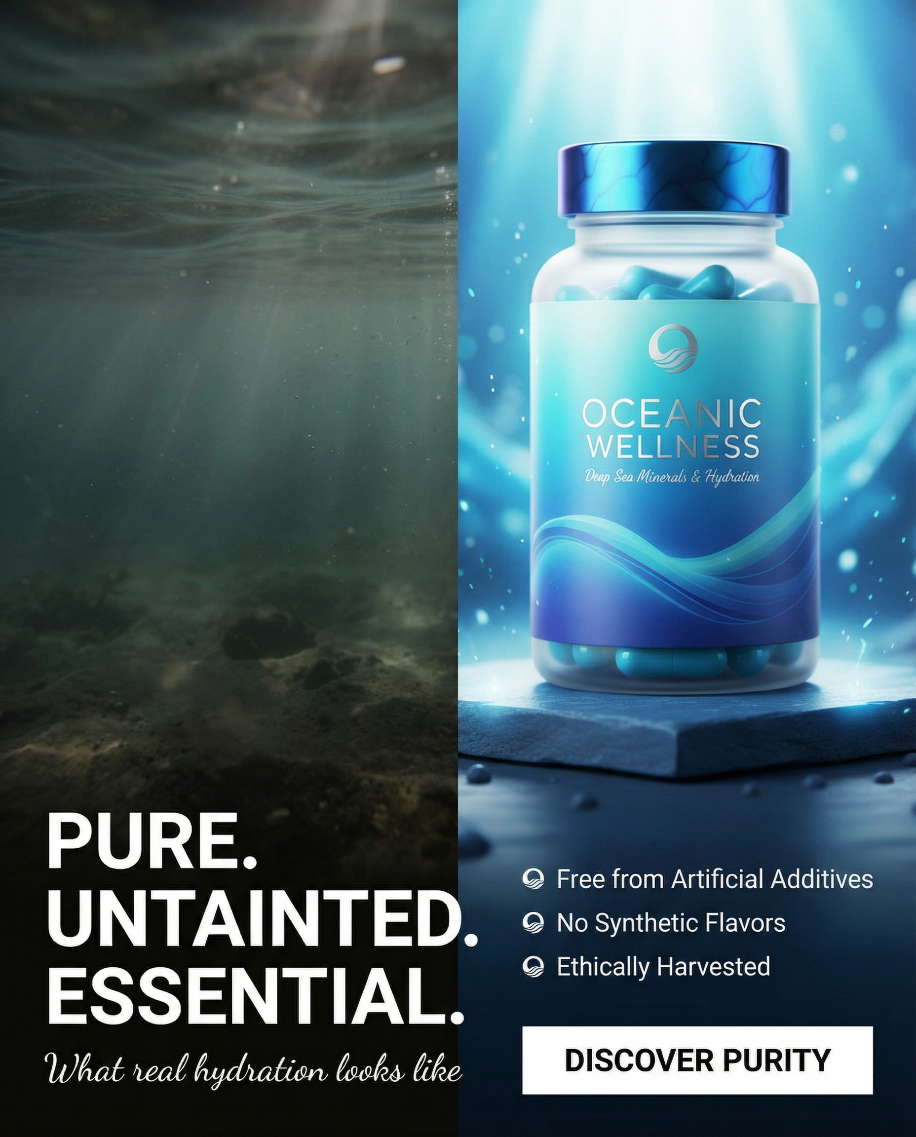
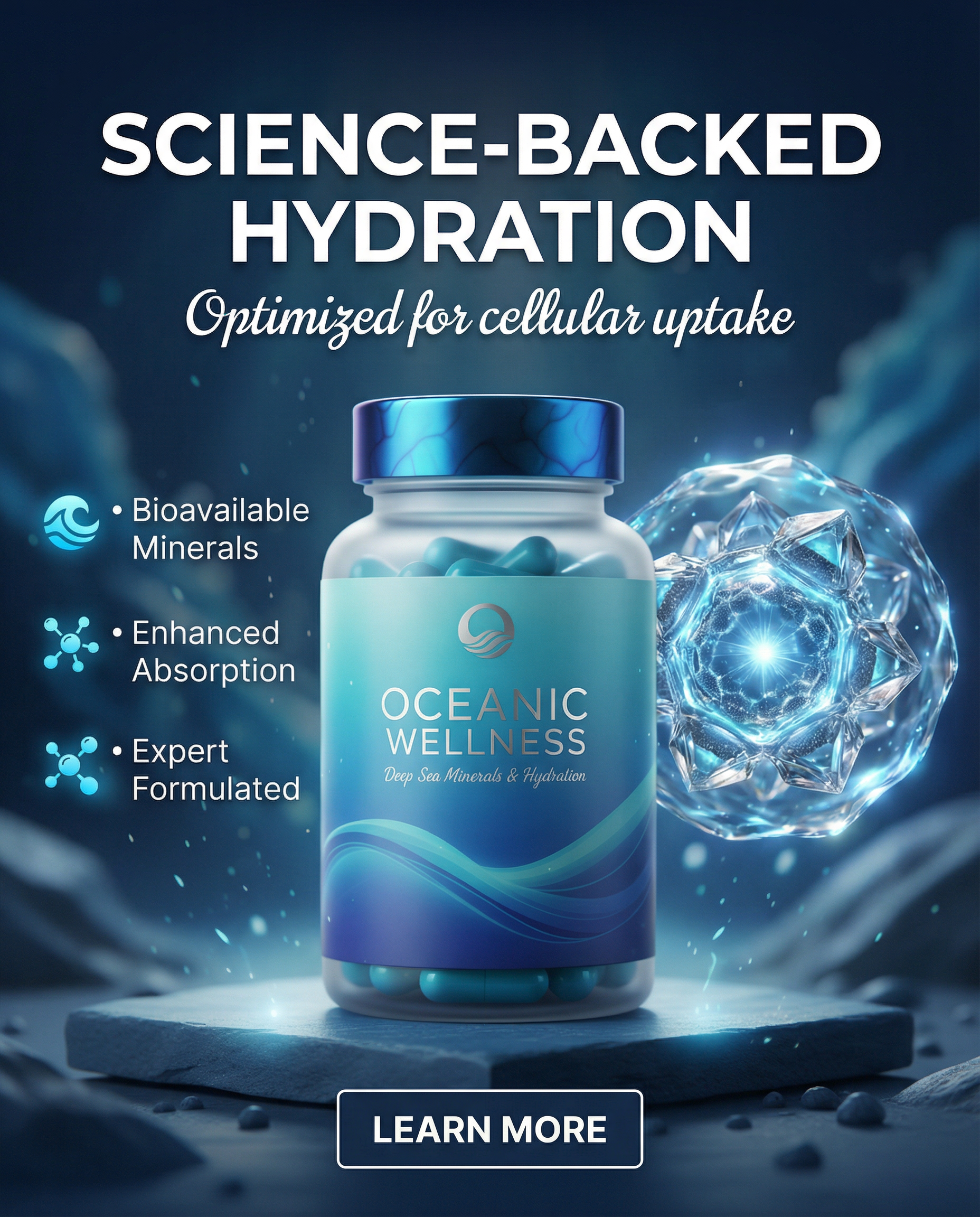
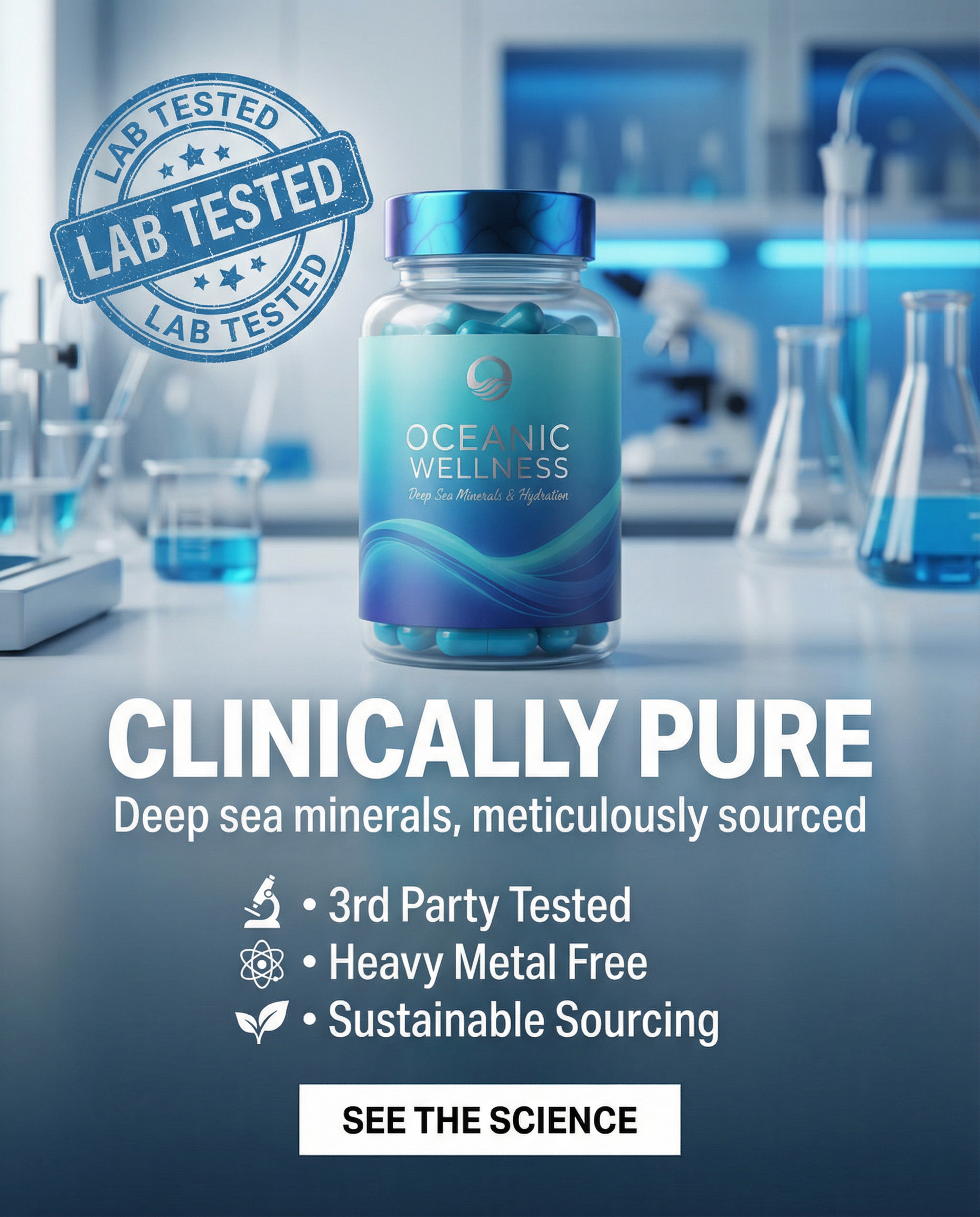
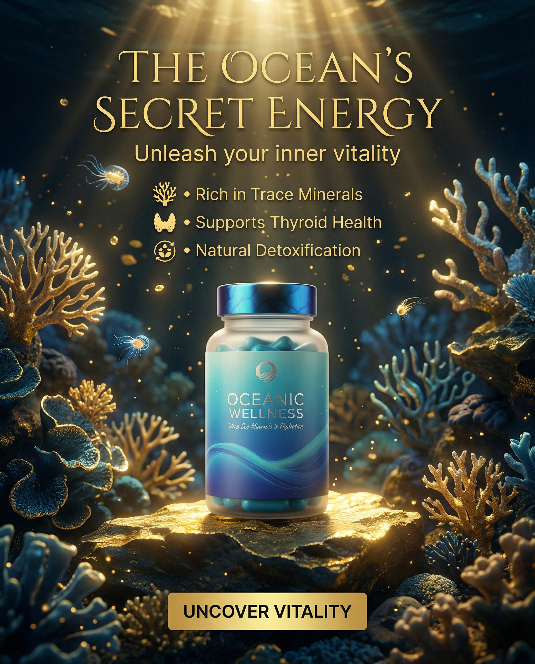
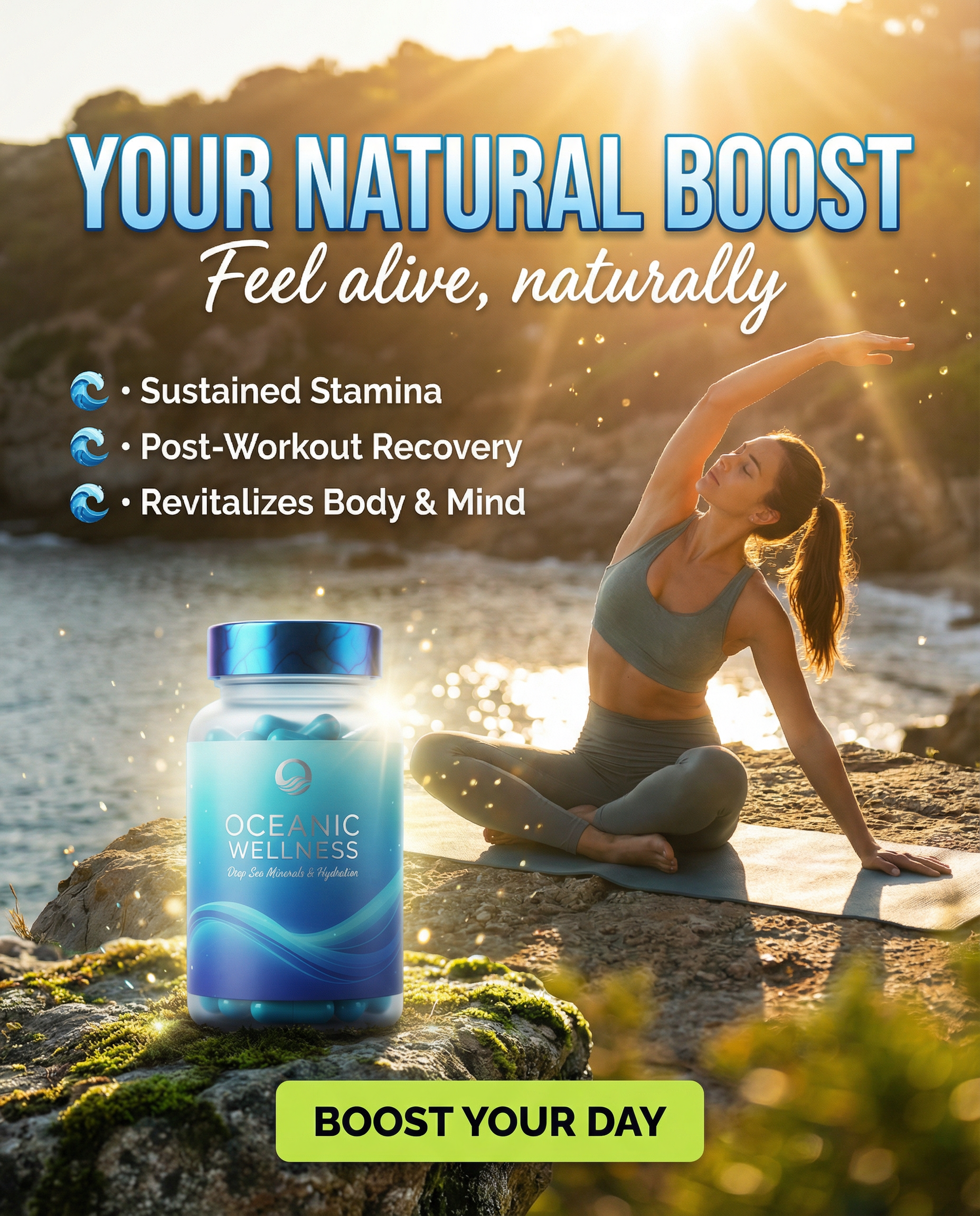
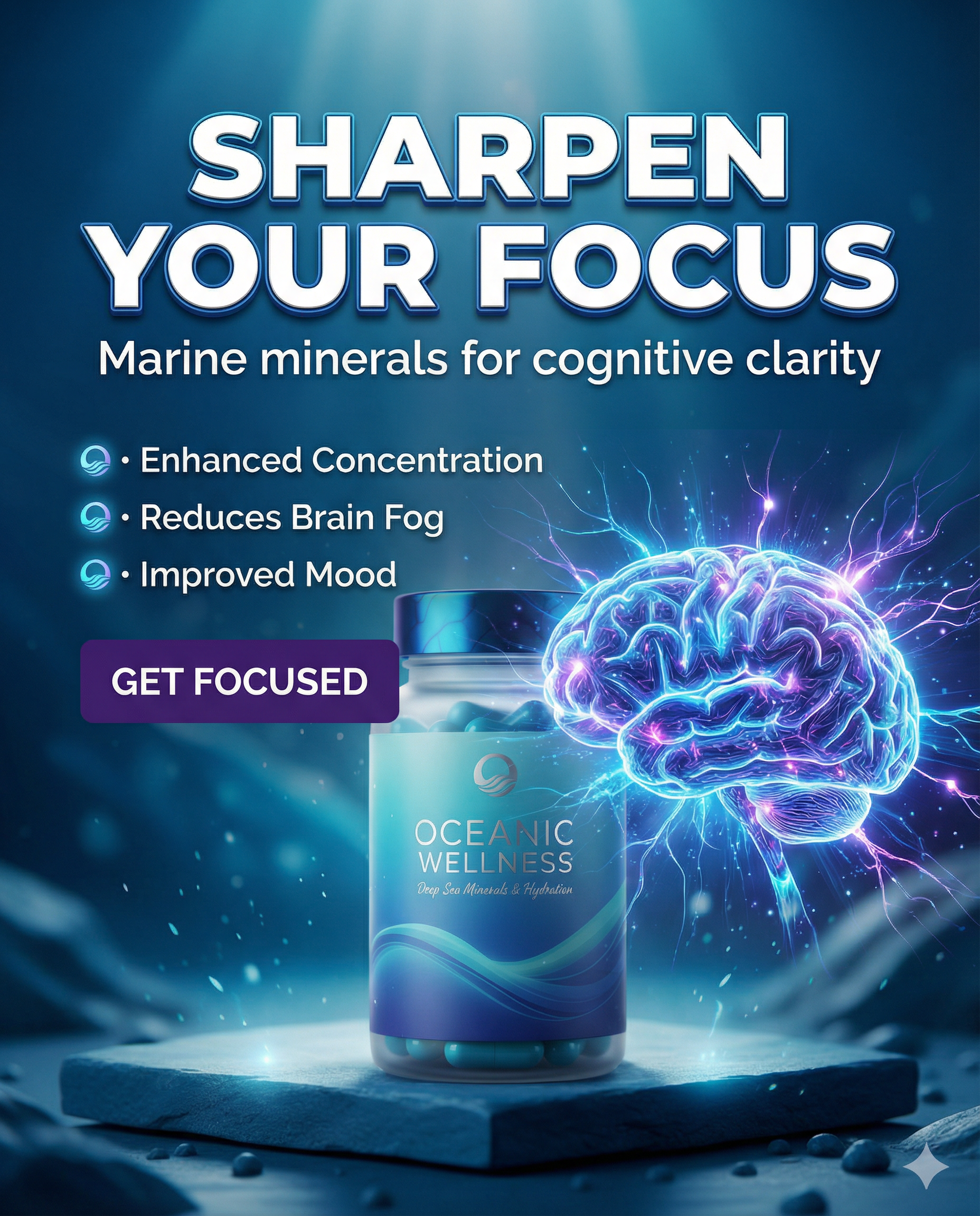
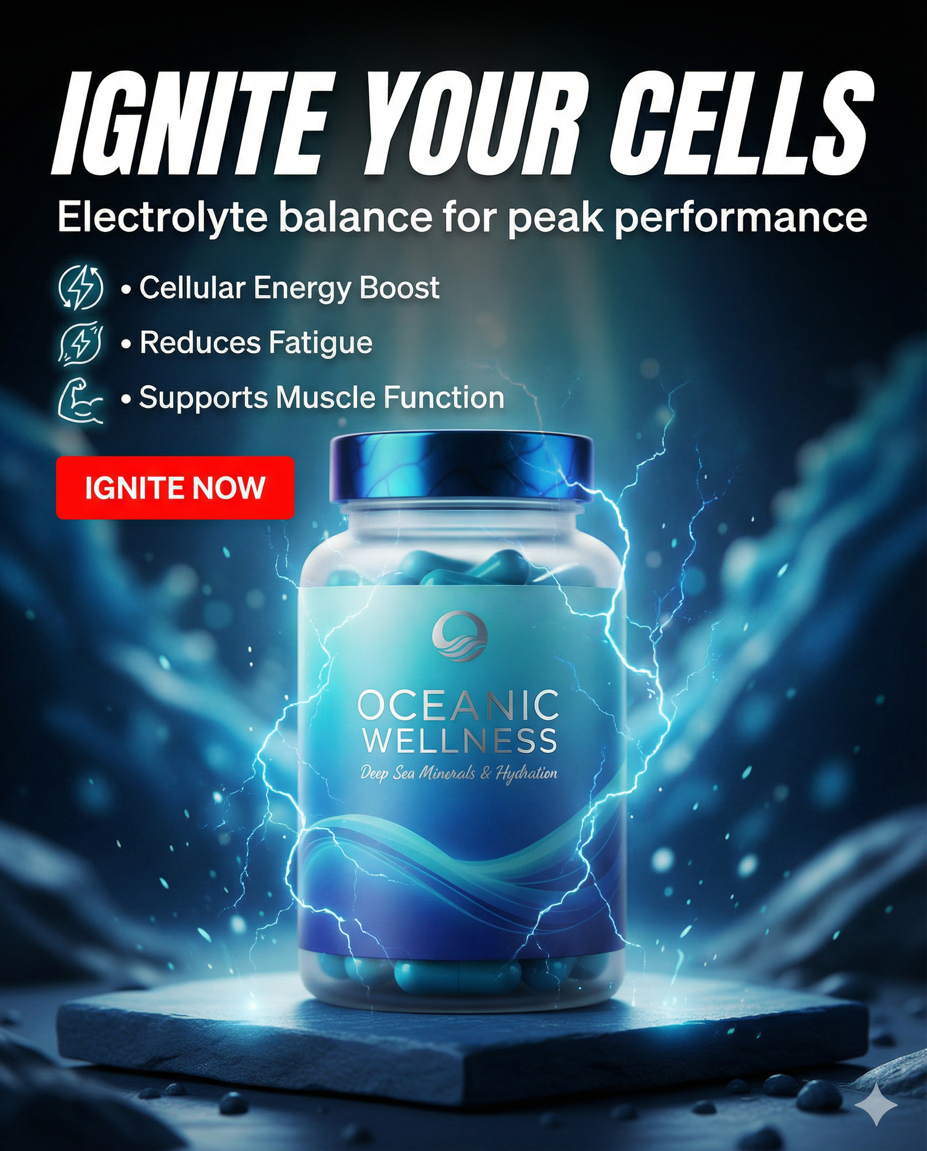
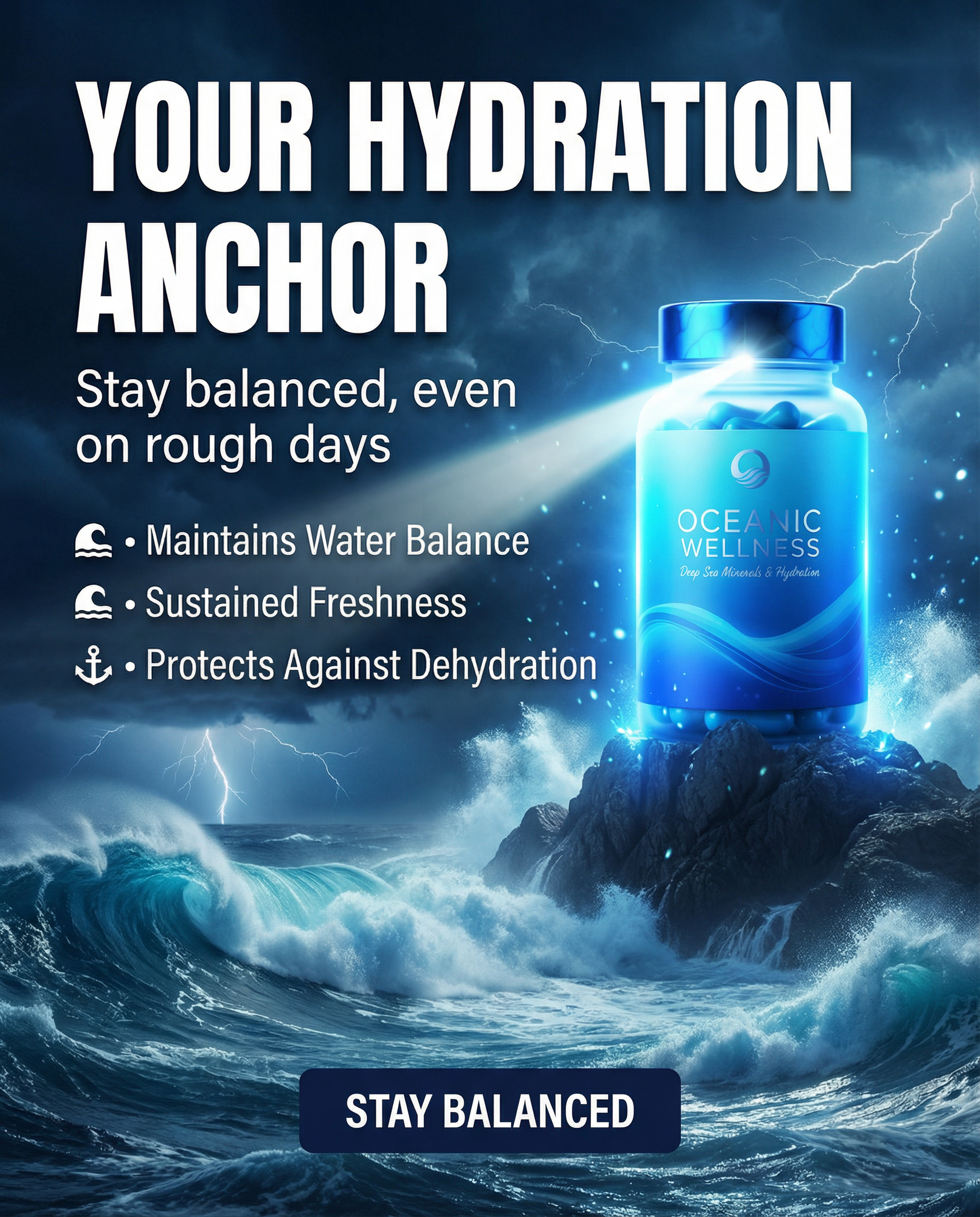
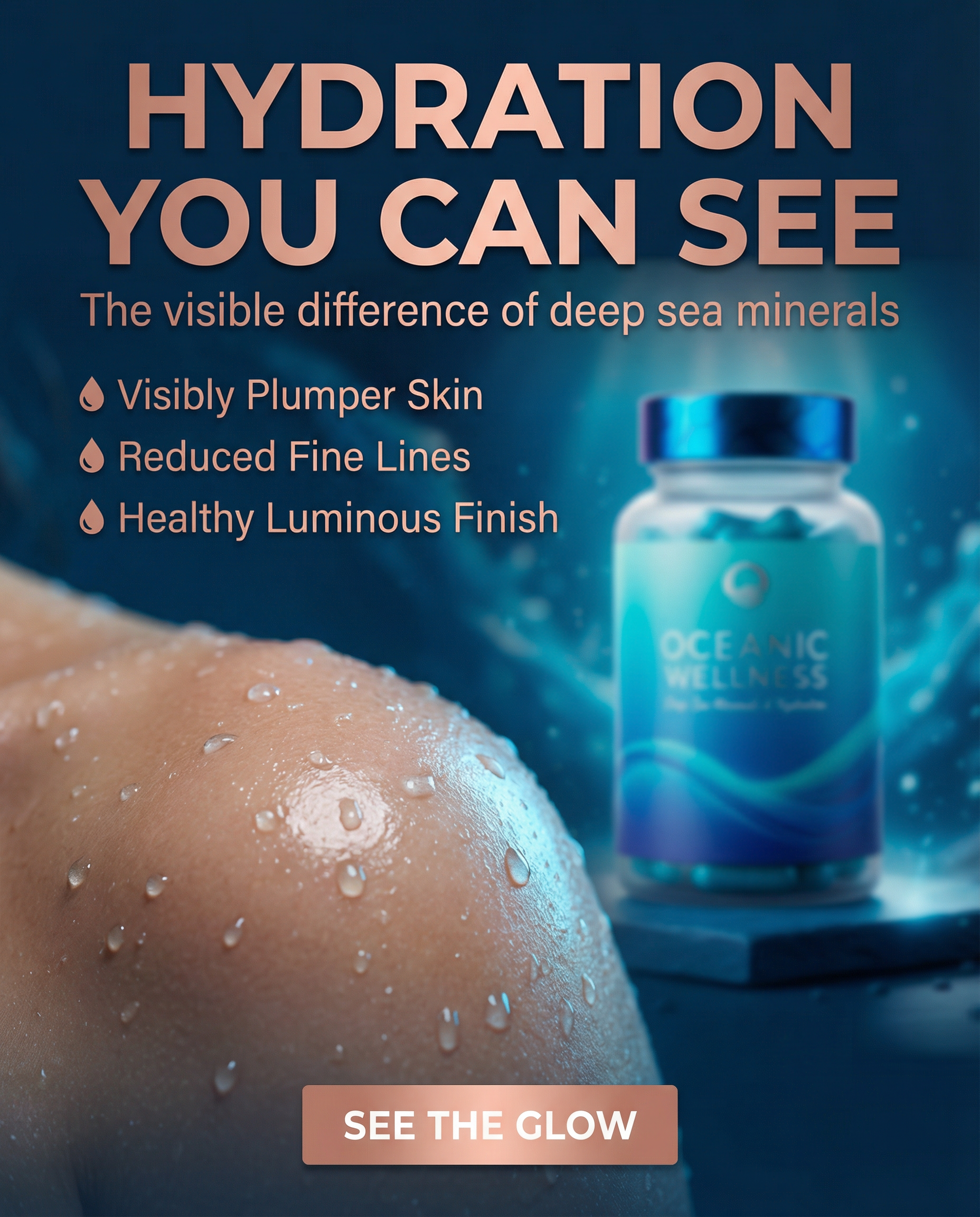
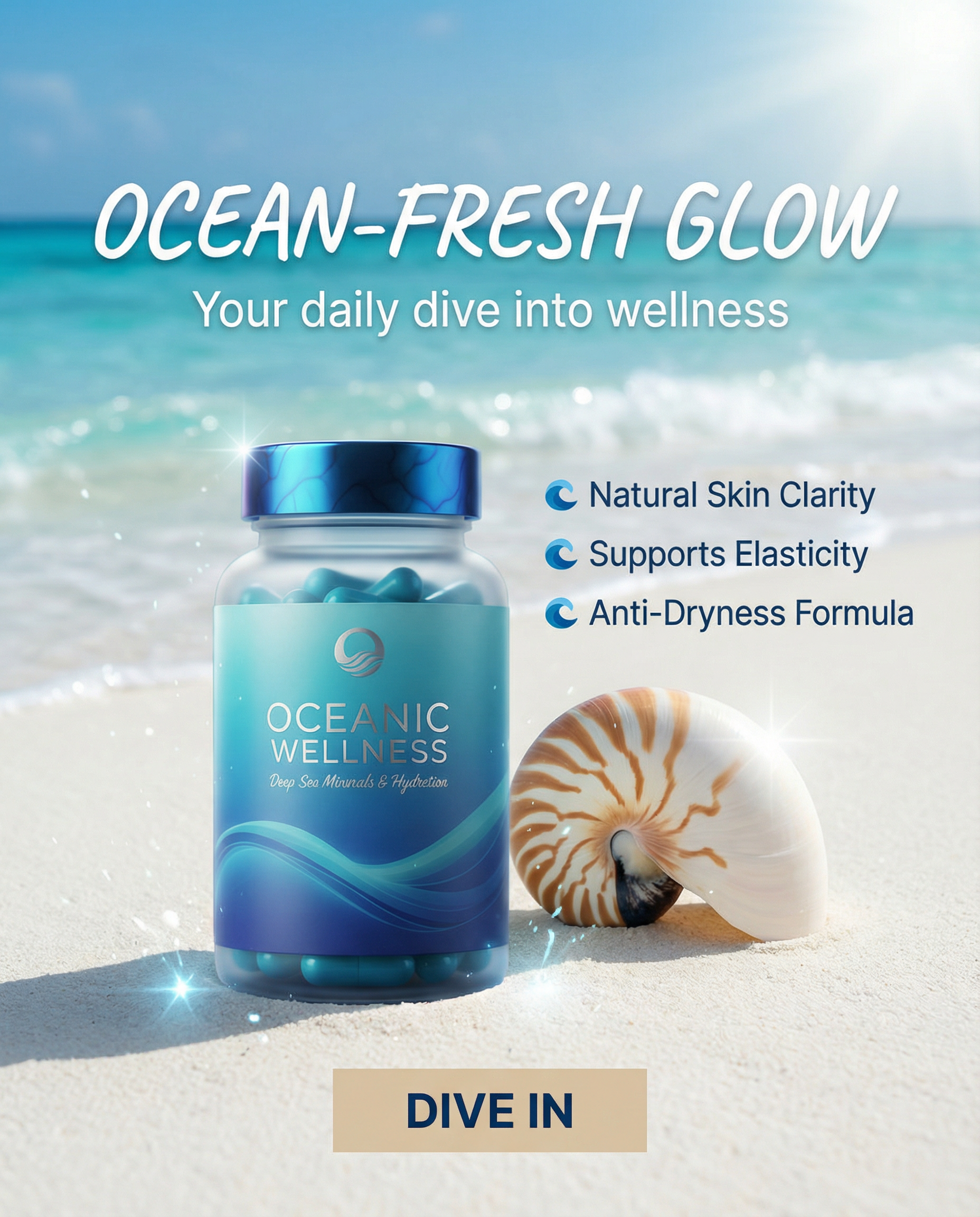
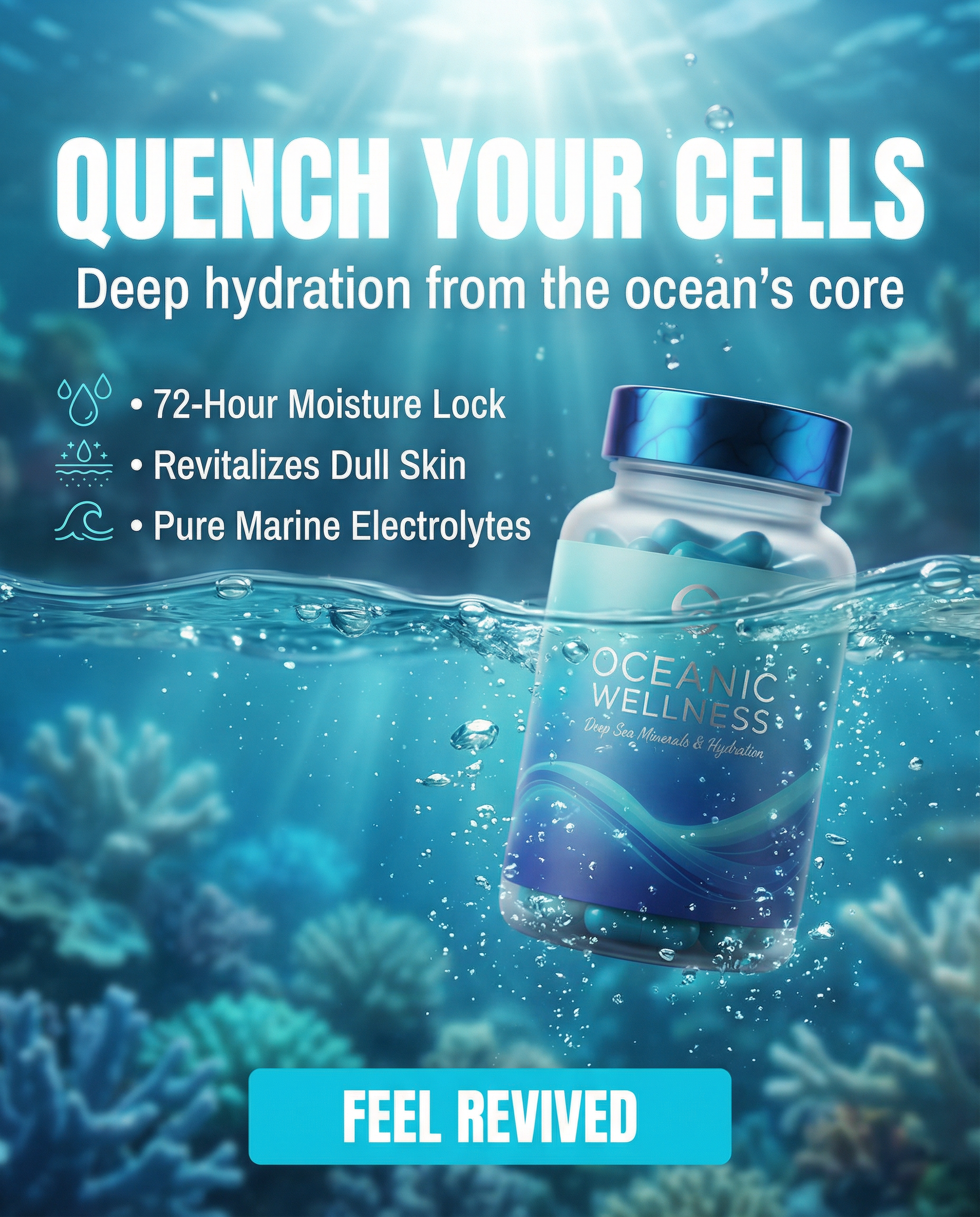
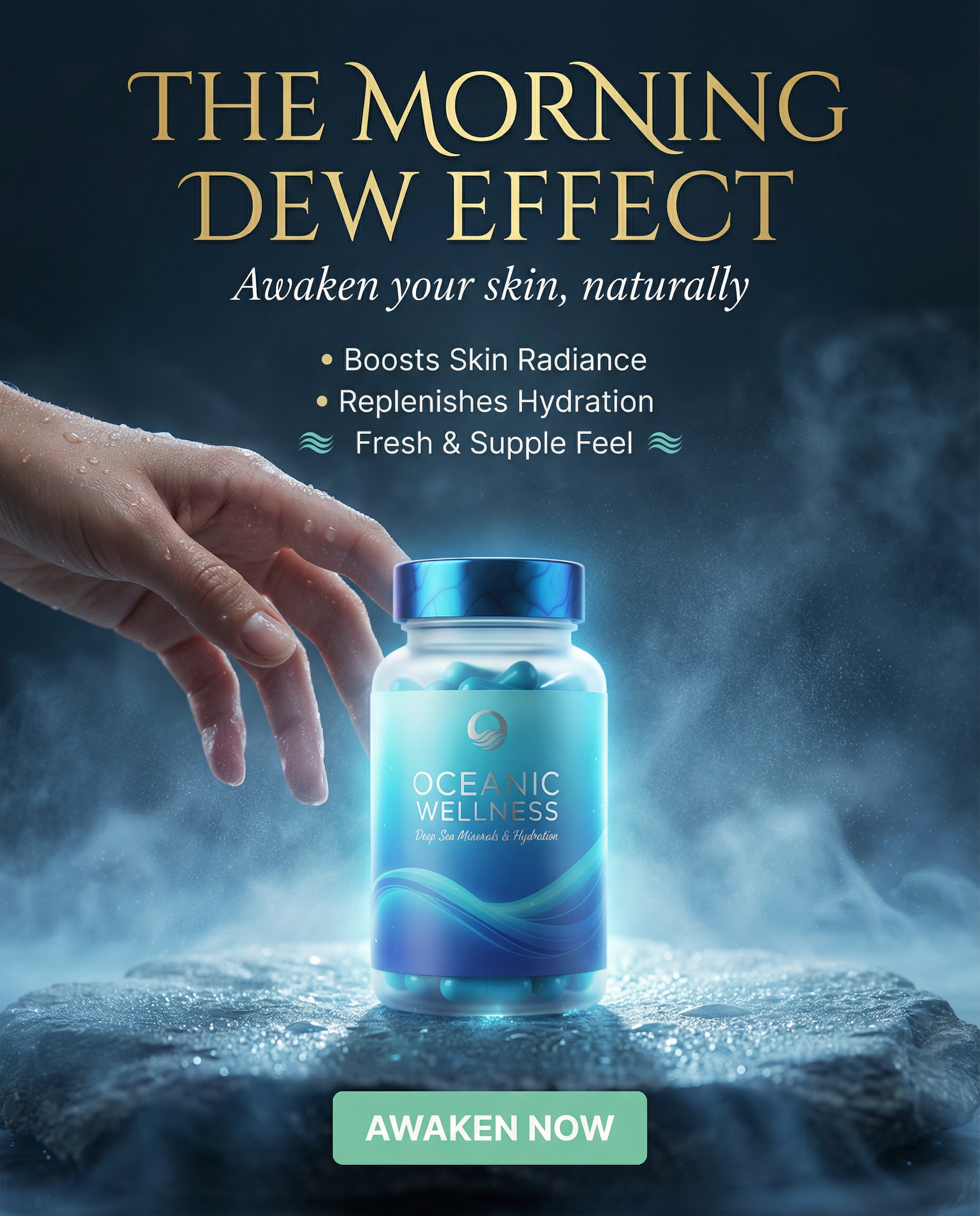
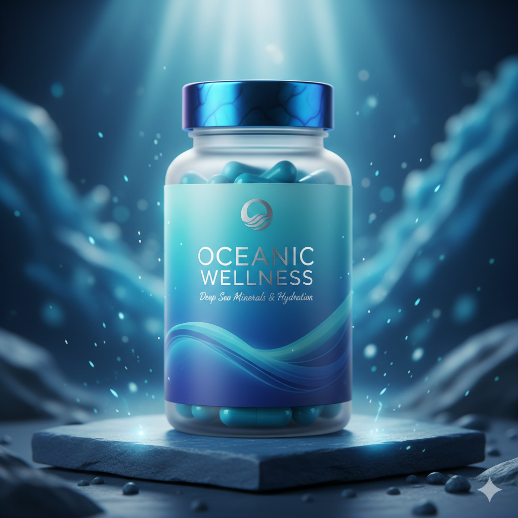
Project Overview Client: Oceanic Wellness™ (High-End Nutraceuticals) Niche: Health & Wellness / Supplements Deliverables: 20 High-Concept Static Ad Assets Objective: Establish brand authority and drive high-intent traffic through "Science-Meets-Nature" visual storytelling. The Challenge The supplement market is notoriously difficult due to extreme competition and strict advertising policies on Meta. Oceanic Wellness™ needed to move away from "medical-looking" ads to a premium lifestyle and performance aesthetic that justifies a high price point. Key Hurdles: Ad fatigue: Users are tired of seeing "magical pills." High bounce rates: Customers often don't understand the difference between cheap minerals and deep-sea minerals. Visual monotony: Most competitors use boring white-label designs. Target Audience & Psychology Primary Audience: Health-conscious high-performers (30-50) and skincare enthusiasts. Deep-Seated Pain Points: Brain Fog & Fatigue: Feeling drained by 2:00 PM despite drinking water. Cellular Dehydration: Skin looking dull and "tired" regardless of topical creams. Product Overload: Tired of taking 10 different supplements with zero visible results. Purity Concerns: Fear of heavy metals and microplastics in marine-sourced products. Creative Strategy: The "Deep Sea" Framework I utilized the Oceanic Blue Palette to trigger psychological associations with purity, calmness, and depth. The creative strategy was split into 4 conversion-focused angles: Angle 1: Sensory Satisfaction (Hydration Revival) Focus: Making the user "feel" the hydration through the screen. Visuals: Crystal-clear water, bubbles, and "glass-skin" textures. Angle 2: Raw Energy (Performance-Driven) Focus: Shifting from "avoiding sickness" to "achieving peak performance." Visuals: Crashing waves, jagged rocks, and high-contrast dramatic lighting. Angle 3: The Scientific Standard (Authority) Focus: Overcoming skepticism through transparency and lab-tested aesthetics. Visuals: Minimalist laboratory settings, 3D molecular structures, and trust badges. Angle 4: The Minimalist Shift (Escape Competition) Focus: Positioning Oceanic Wellness as the only supplement needed. Visuals: Decluttered spaces, "One Capsule" vs. "Ten Bottles" comparisons. Execution Excellence Direct Response Copy: Headlines focused on immediate benefits (e.g., "End the Dry Spell") rather than vague features. UI-Integrated CTAs: Contrast-heavy rectangular buttons (Aqua, Neon, White) designed to mimic app interfaces for higher clickability. Metaphorical Imagery: Using ocean waves and lighthouses to represent energy and stability, stopping the scroll through high-art concepts. Benefit Hierarchy: Each ad clearly displays 3 bullet points to address "What's in it for me?" in under 2 seconds. Expected Results / KPIs CTR Optimization: Expected 1.8% - 2.5% CTR by utilizing high-concept metaphorical visuals. Lower CPA: By addressing "Brain Fog" and "Skin Radiance," the ads filter for high-LTV (Lifetime Value) customers. Brand Premium: Elevated the brand from a "commodity" to a "premium wellness essential."