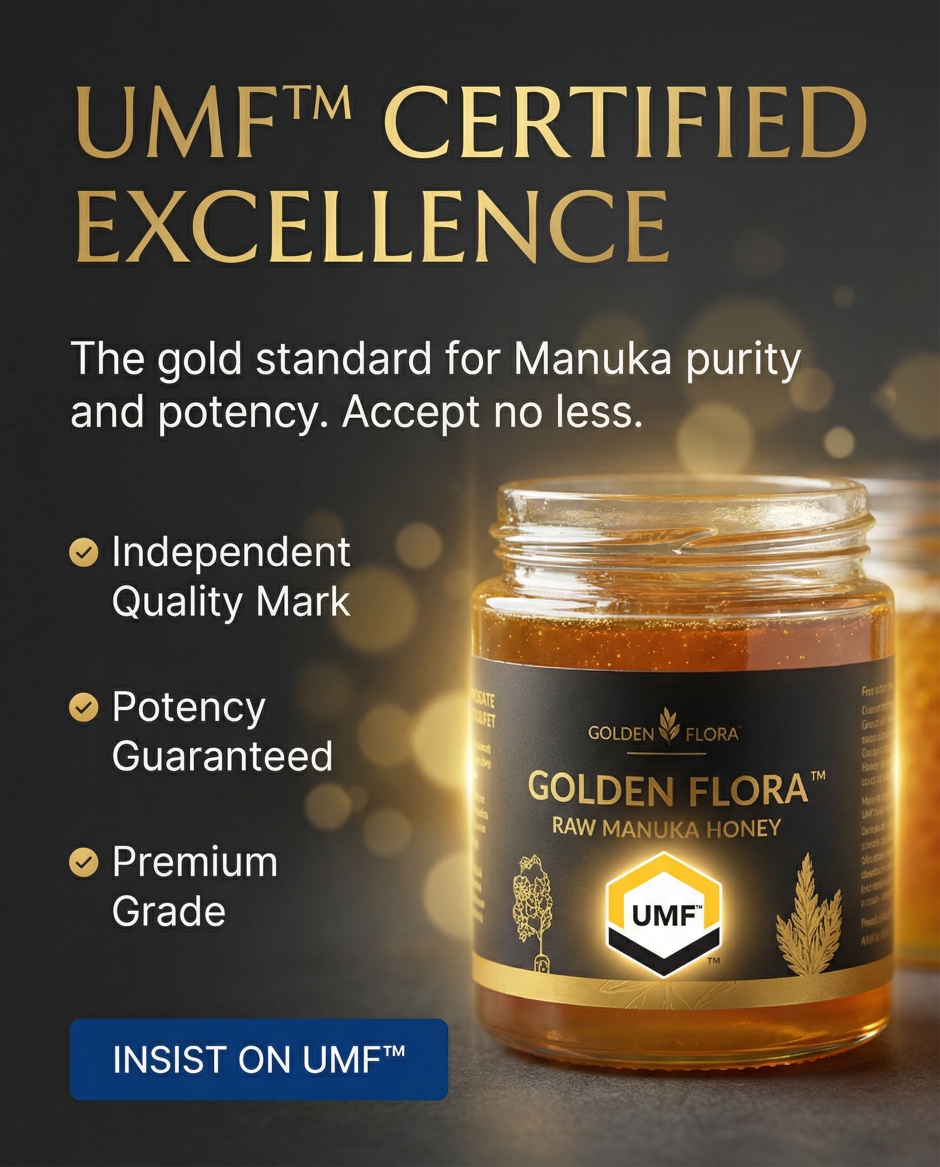
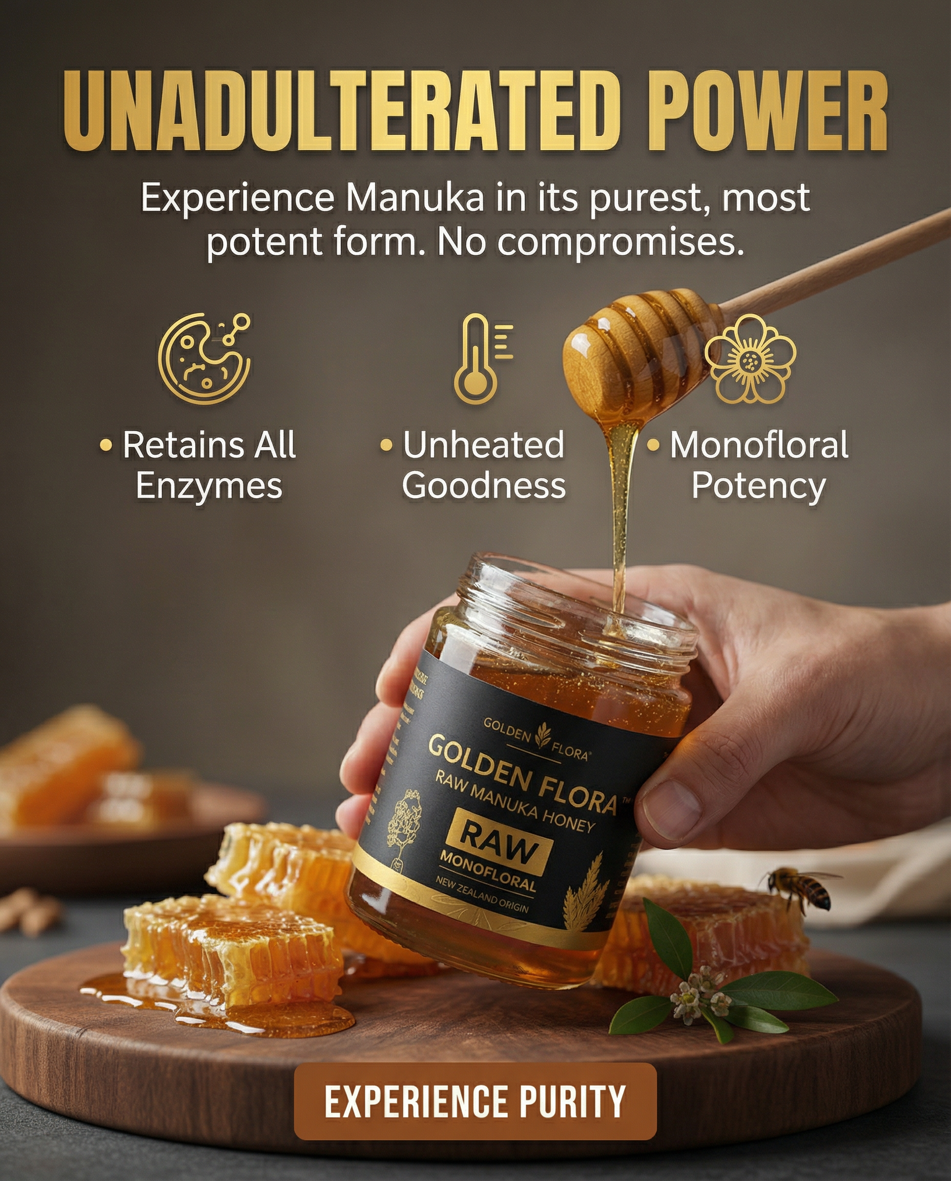
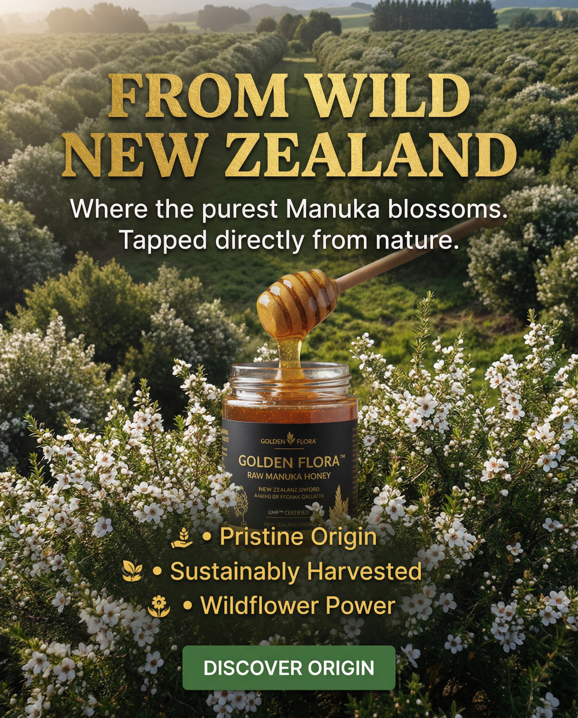
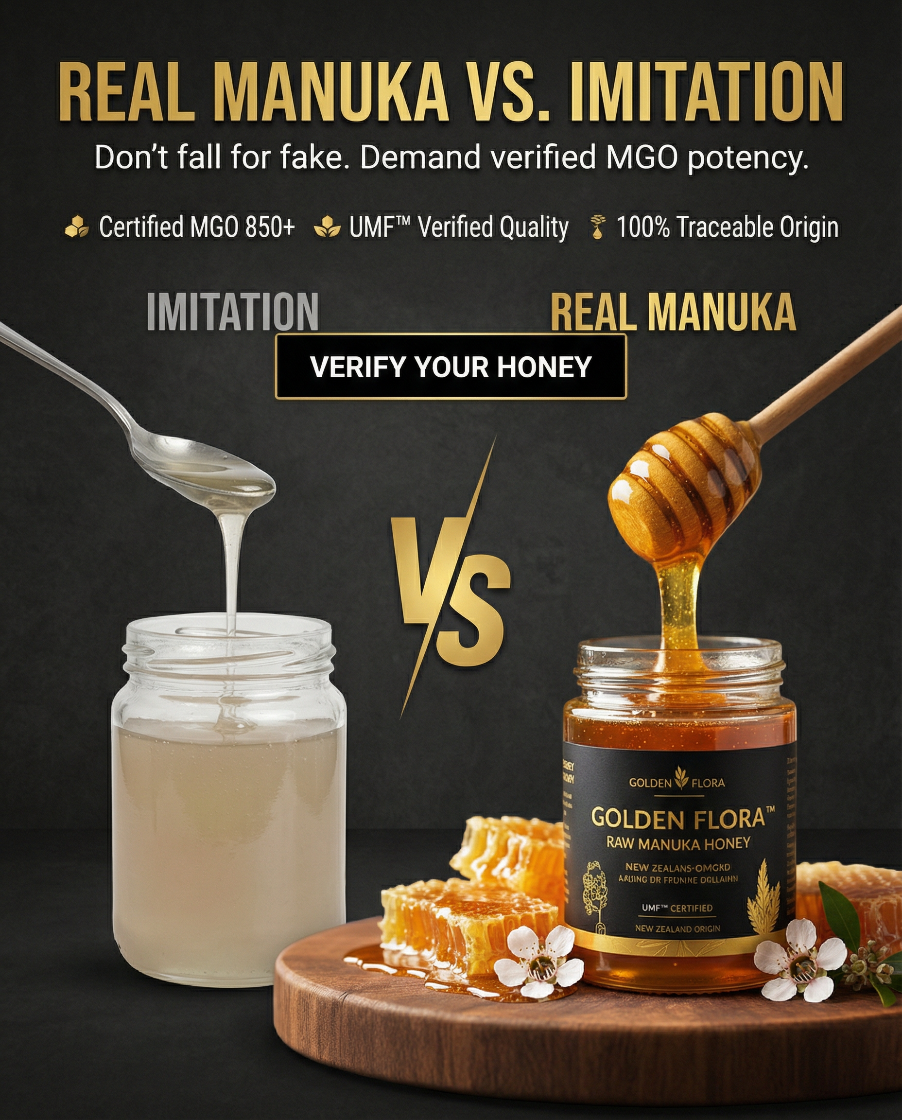
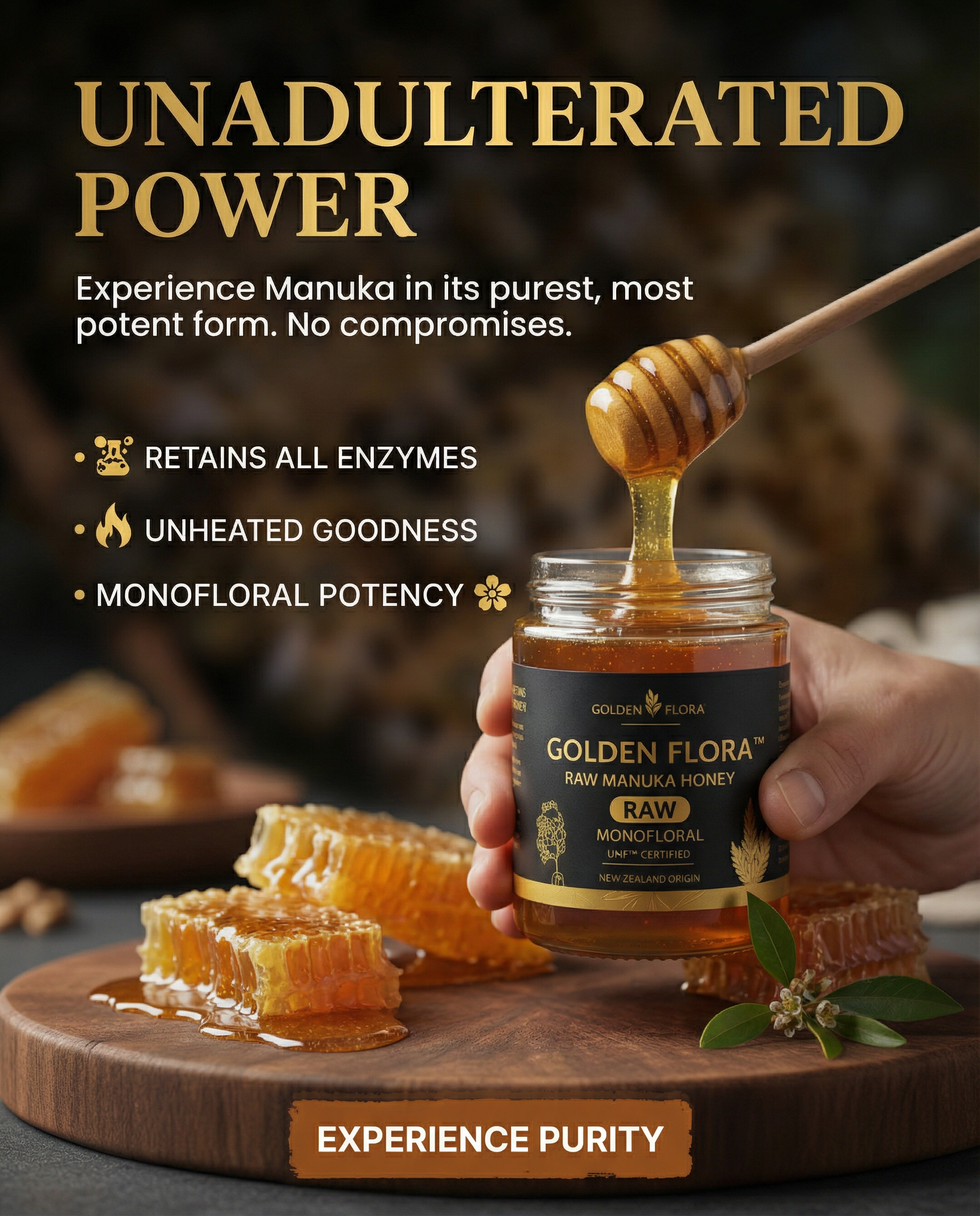
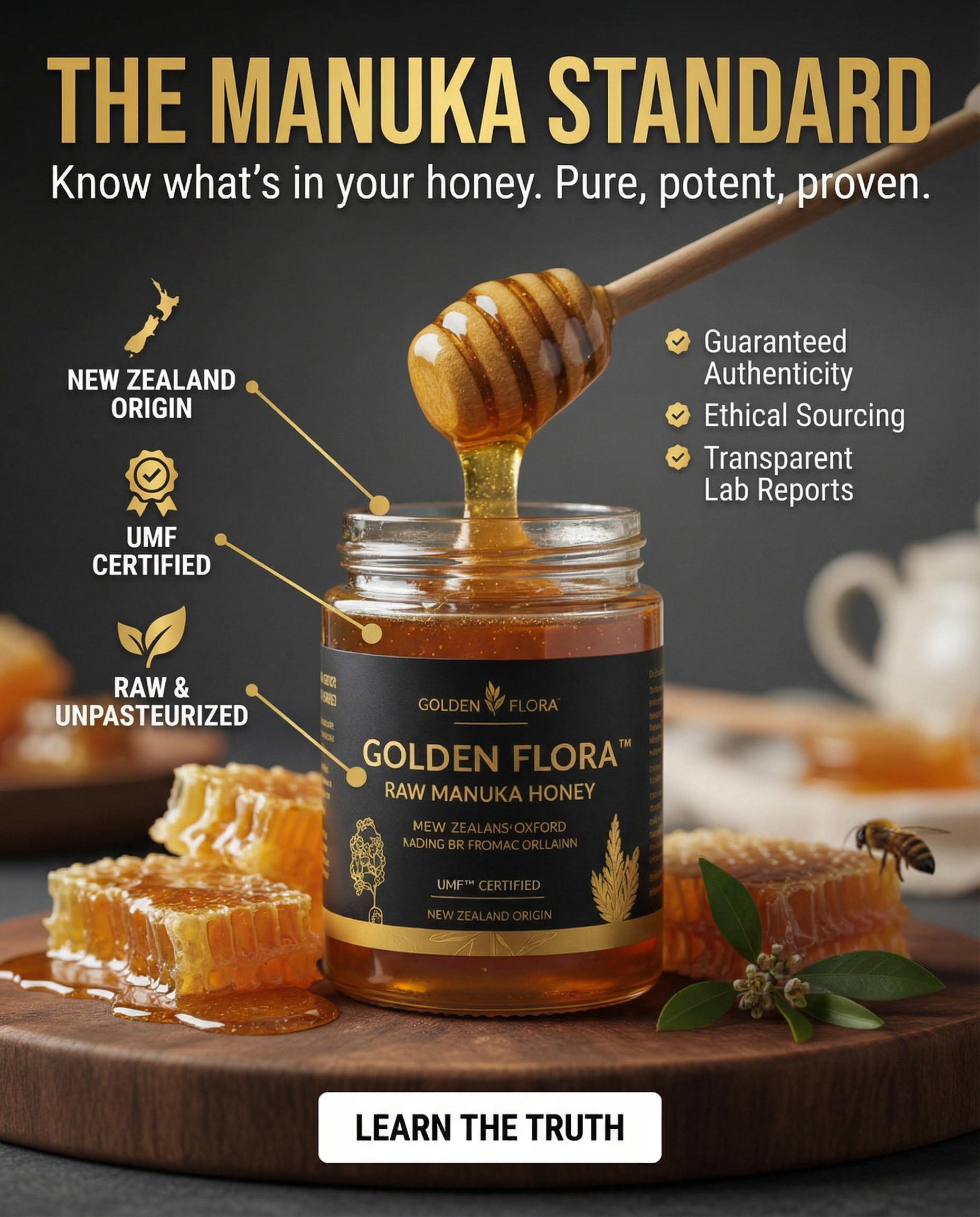
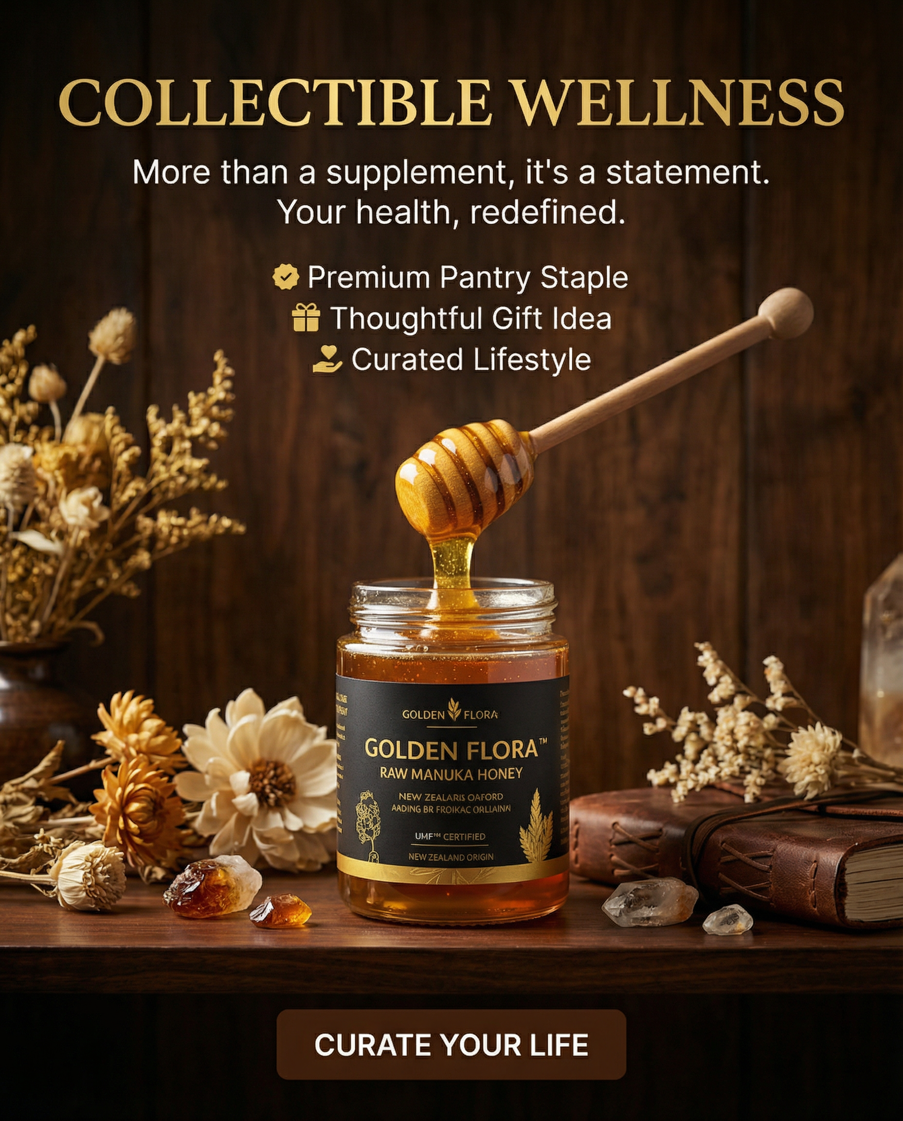
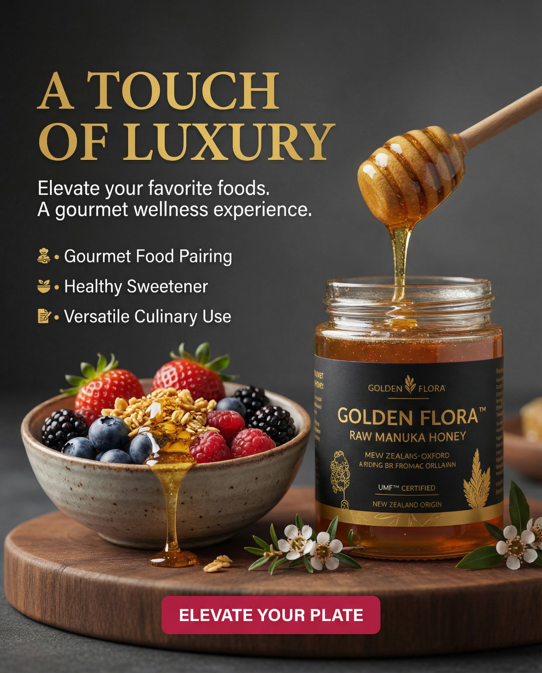
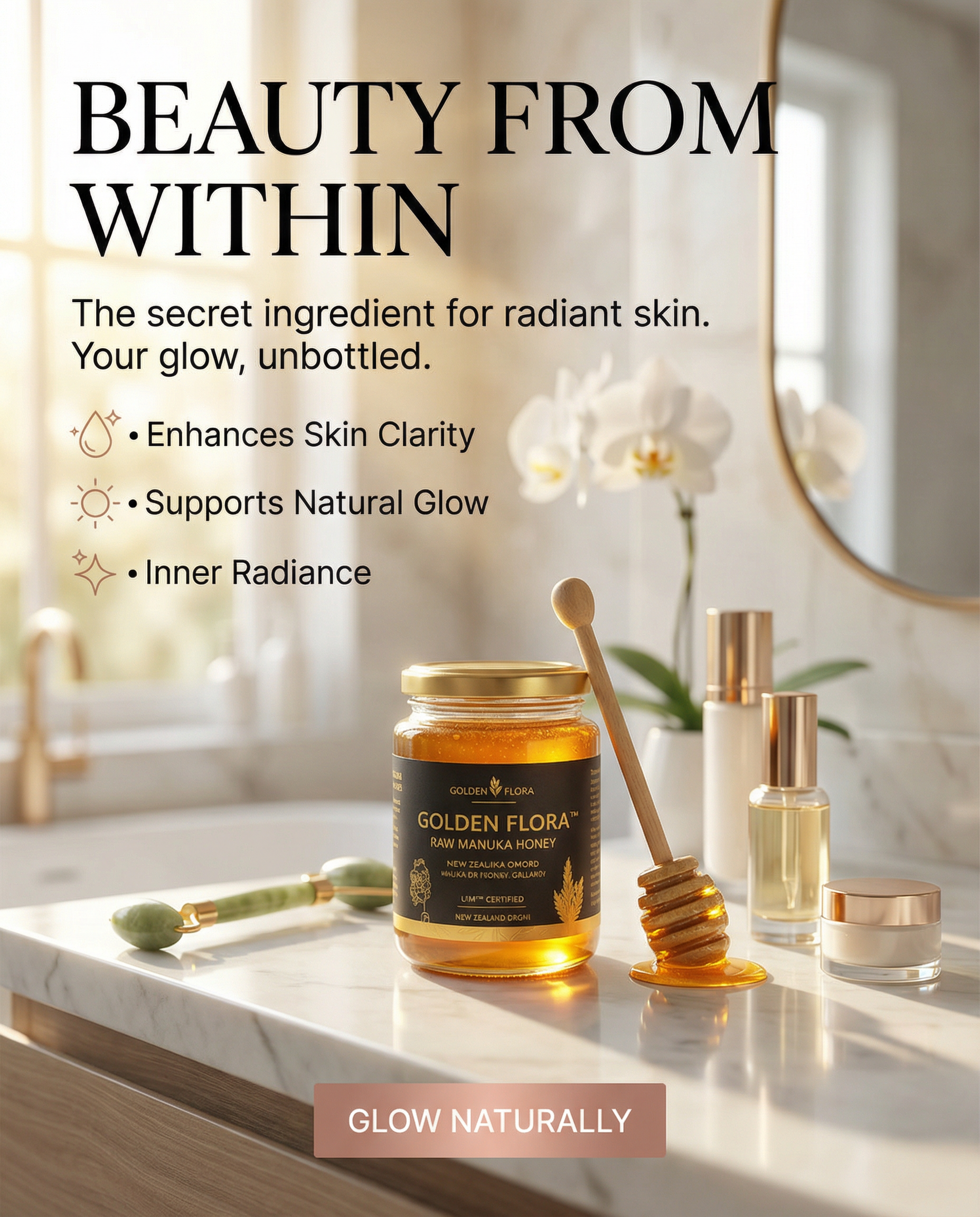
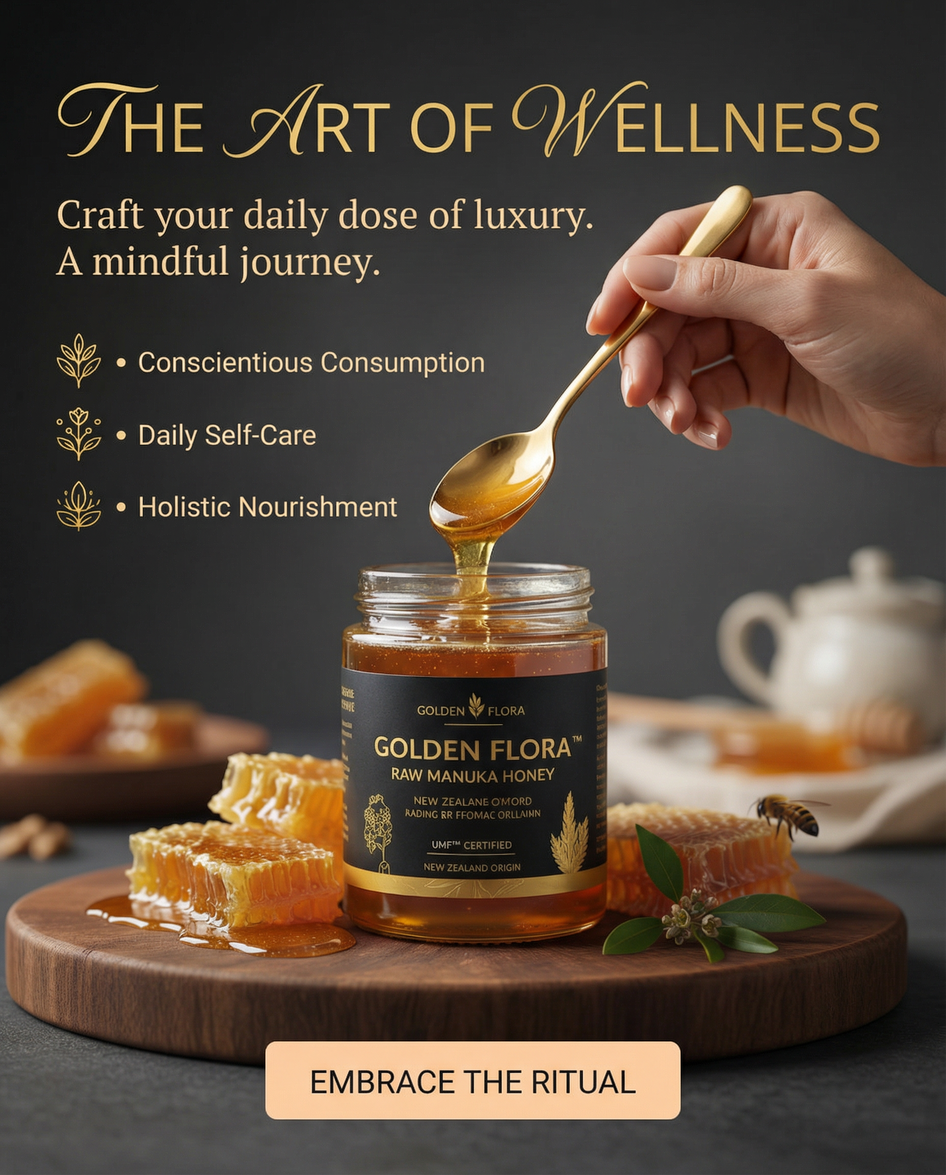
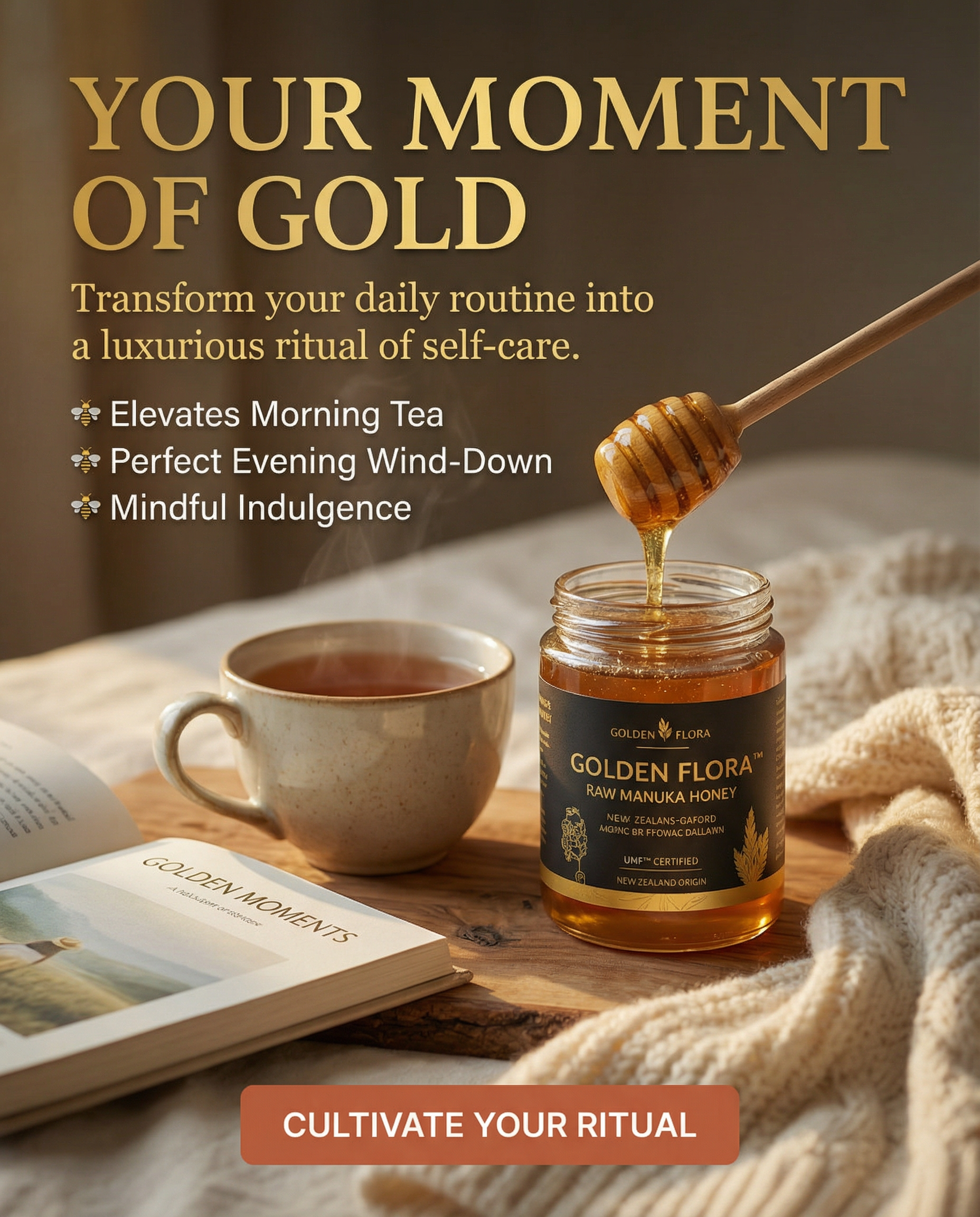
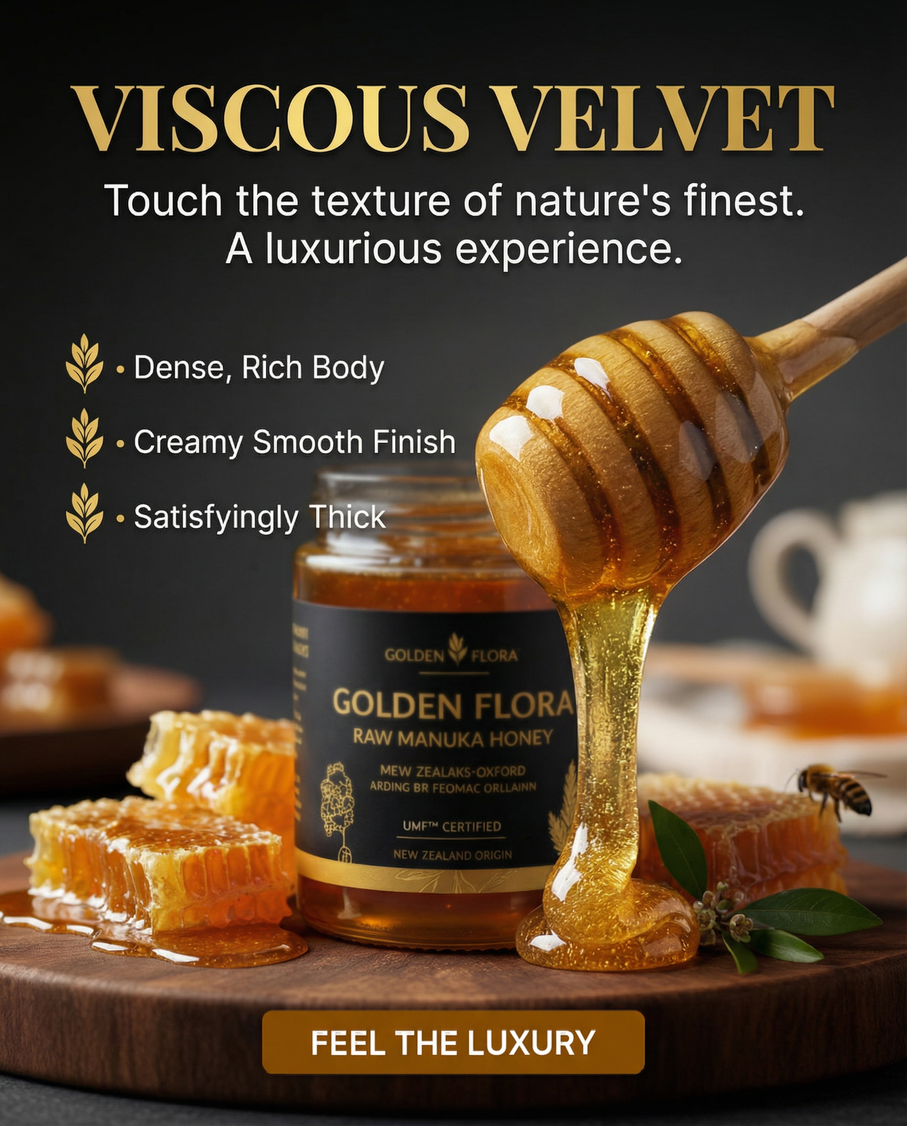

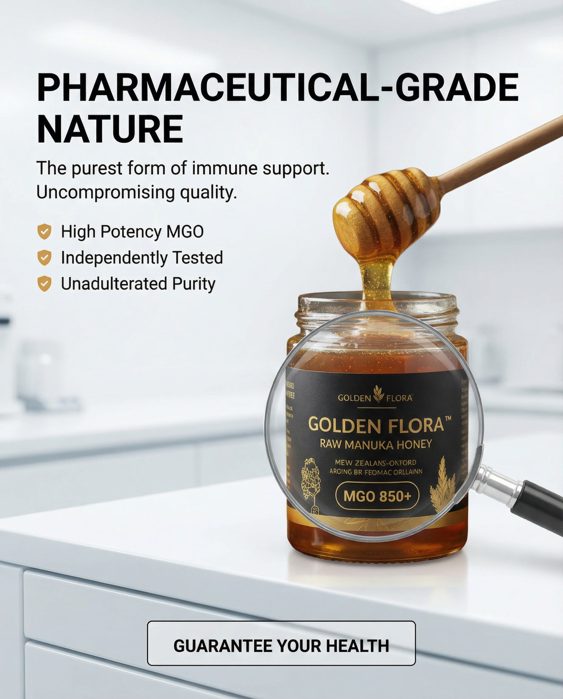
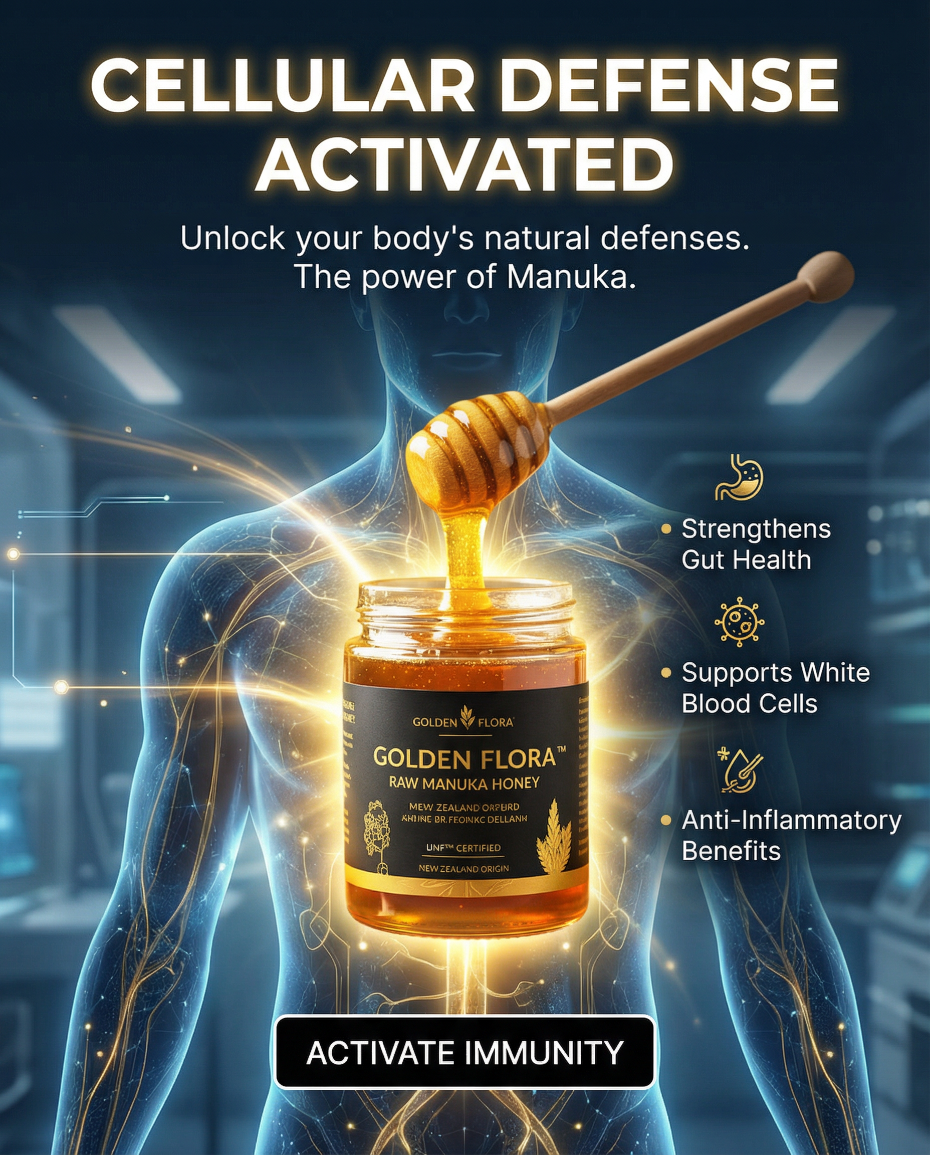

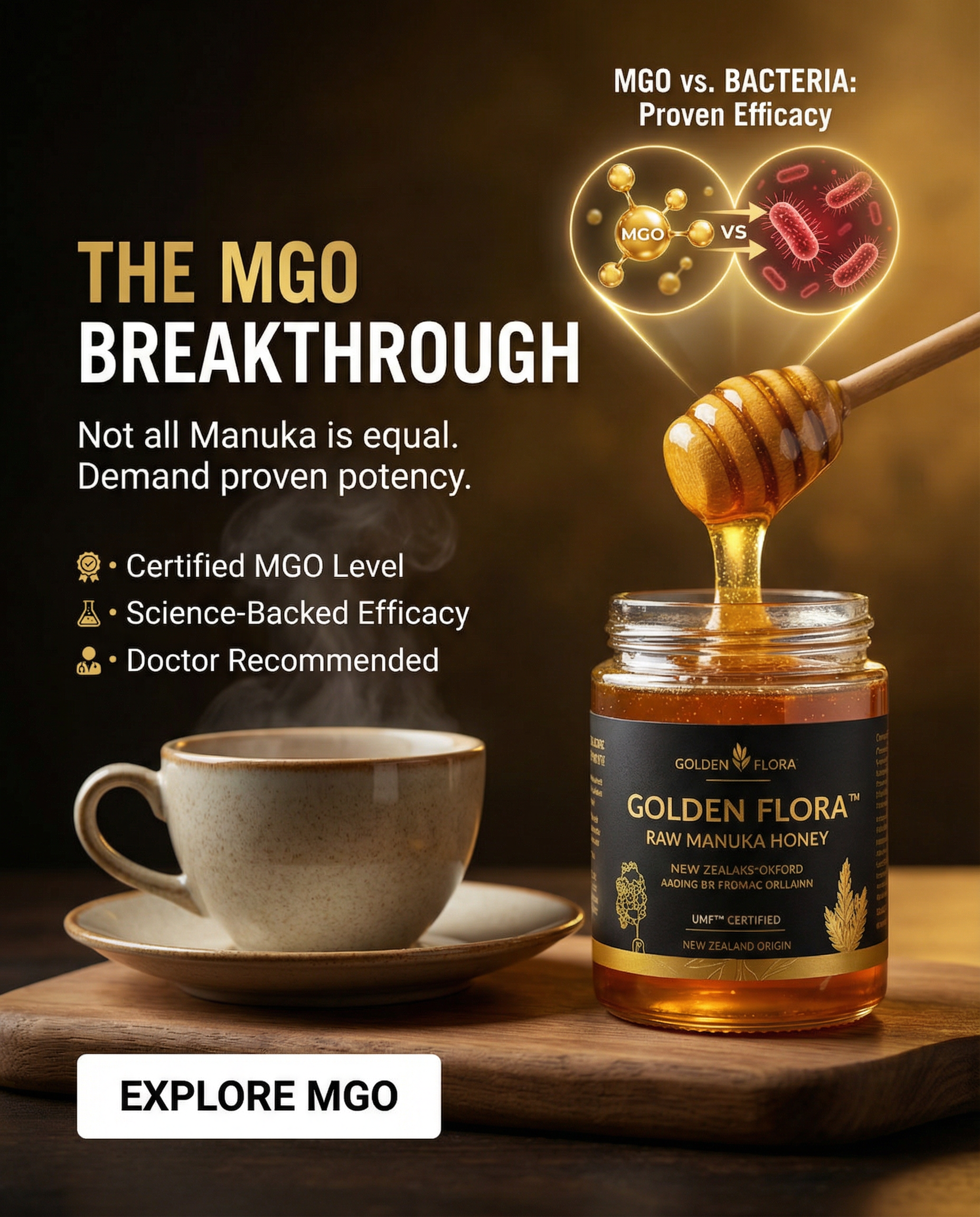
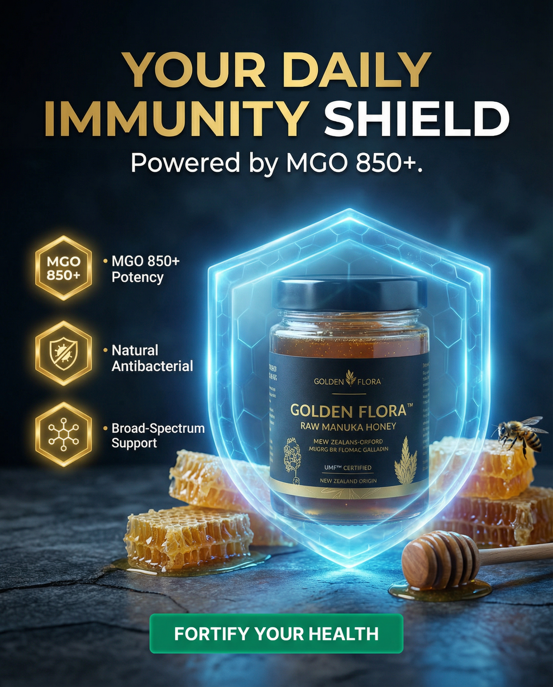
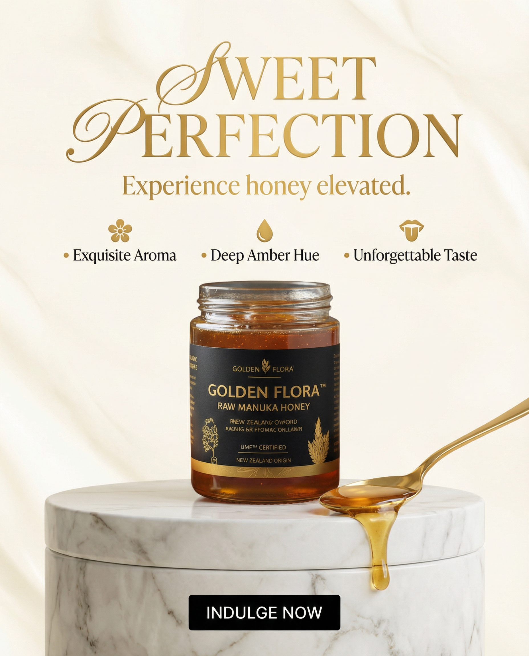
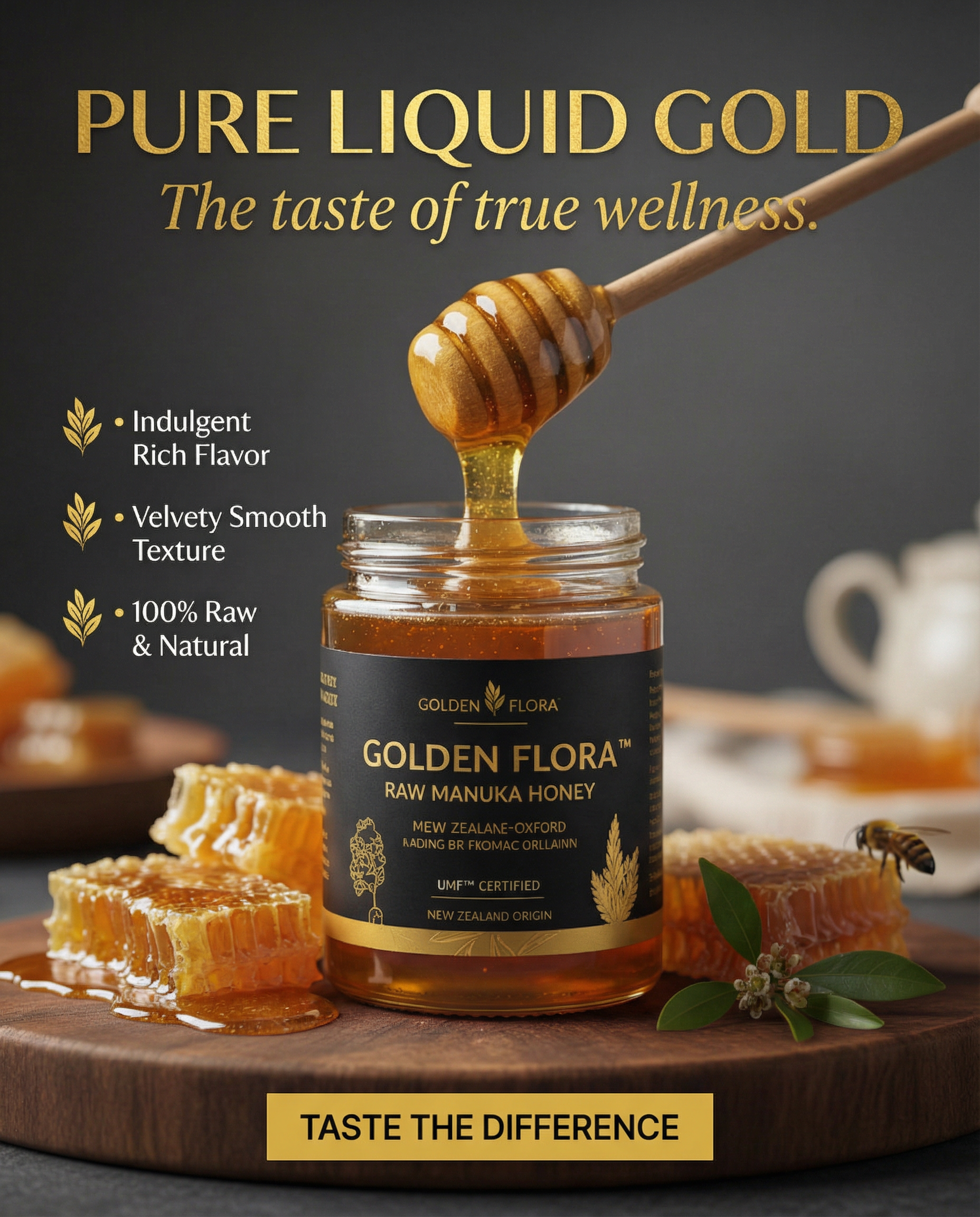
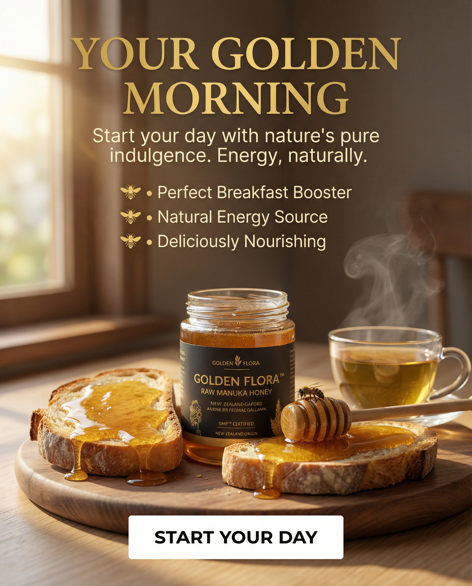
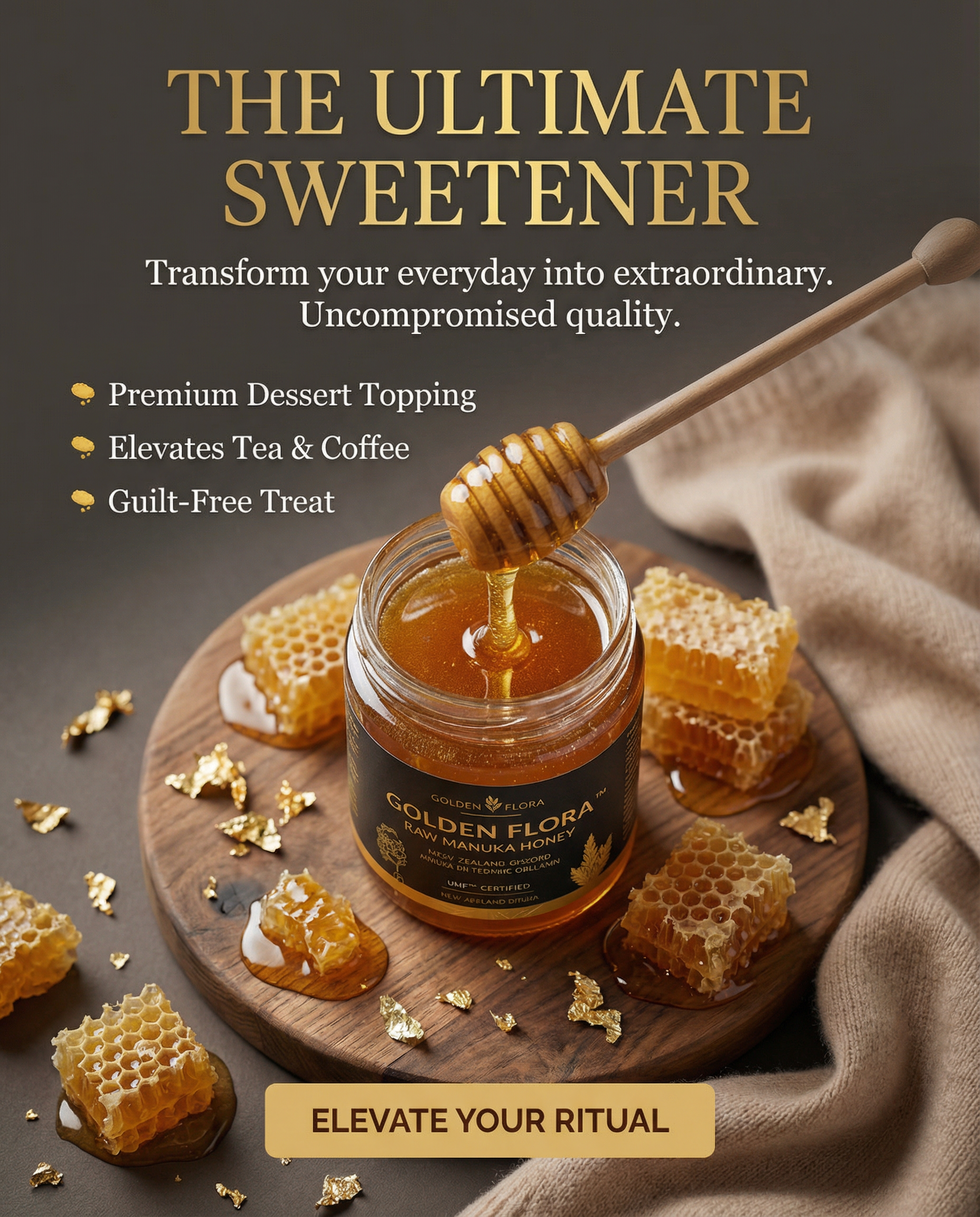
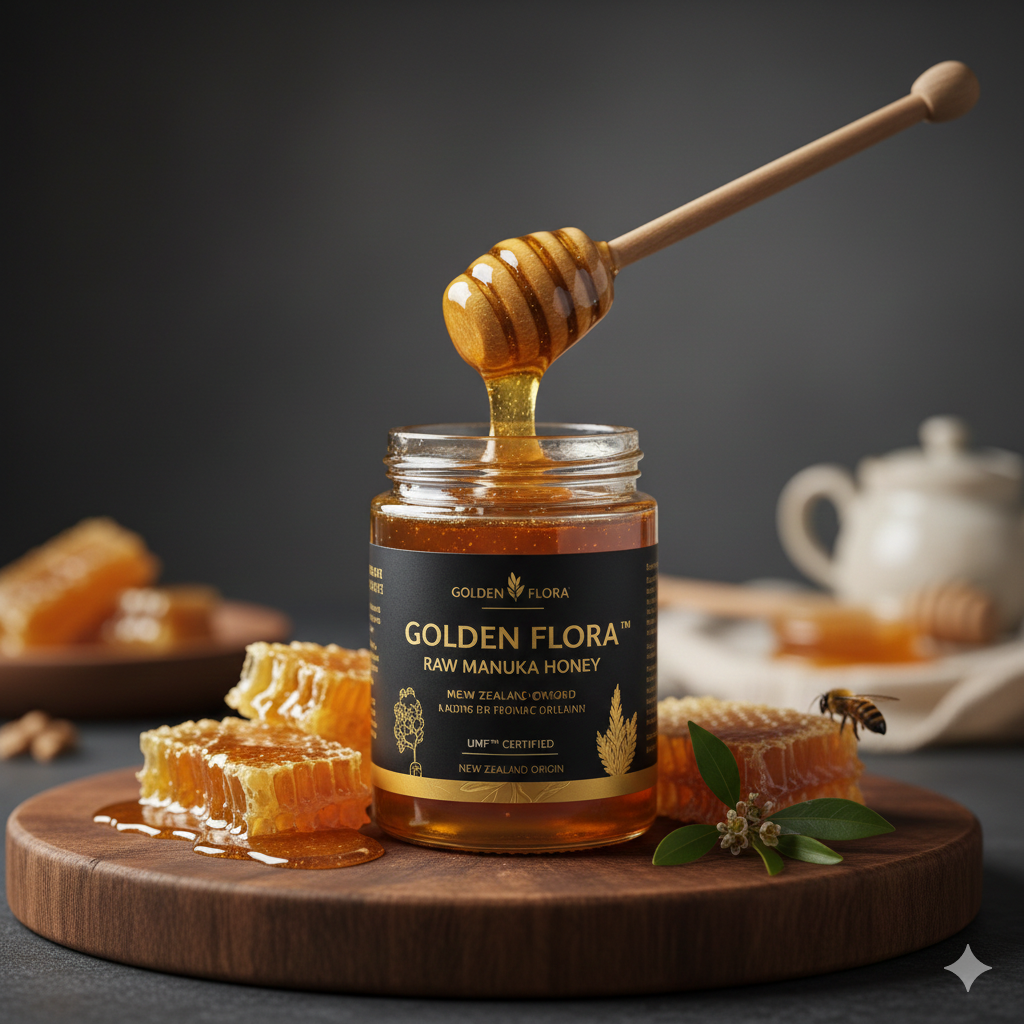
Project Overview Client: GOLD FLORA™ (Luxury Superfoods) Niche: Premium Food / Health & Wellness Deliverables: 100 Strategic Static Ad Assets Objective: High-intent conversion and brand positioning in the luxury grocery segment. The Challenge Manuka Honey is a high-ticket item ($50–$100+ per jar). The main challenge was to differentiate GOLD FLORA™ from "regular" honey found in supermarkets and justify the premium price point through visual authority and scientific proof (MGO 850+). Key Hurdles: Educating the customer on MGO (Methylglyoxal) potency without being boring. Visual competition with mass-market honey brands. Building trust for a product that is often counterfeited in the global market. Target Audience & Pain Points Primary Audience: Health-conscious luxury shoppers (30-55), biohackers, and mothers seeking natural immunity boosters. Key Pain Points: Low Immunity: Frequent seasonal illnesses and slow recovery. Gut Health: Digestive discomfort and inflammation. Product Quality: Skepticism about the authenticity of honey. Sugar Fatigue: Seeking a healthy, functional alternative to refined sweets. Creative Strategy: The "Golden Standard" Framework I developed a 4-angle approach to address the audience's psychological triggers, from sensory desire to rational proof. Angle 1: Pure Liquid Gold (Sensory Desire) Goal: Create a "Food Porn" effect to stop the scroll. Visuals: Macro shots of viscous honey, golden drips, and premium wood/marble textures. Angle 2: The Immunity Shield (Functional Proof) Goal: Position the product as a "natural medicine cabinet." Visuals: Scientific metaphors, glowing hexagonal shields, and MGO 850+ callouts. Angle 3: The Luxury Ritual (Lifestyle Alignment) Goal: Make the product an aspirational part of a morning routine. Visuals: Aesthetic "Morning Glow" setups, artisan bread, and designer tea sets. Angle 4: Truth & Transparency (Trust & Authority) Goal: Remove the "counterfeit" fear. Visuals: Comparison charts ("Real vs. Fake"), UMF/MGO certification badges, and New Zealand origin maps. Execution Excellence Brand Consistency: Every ad features the specific straight glass jar with the signature black matte label and gold foil typography. Psychological Trigger Headlines: Using missions like "Announce a New Mechanism" (MGO) and "Sharpen Satisfaction." Conversion-Focused UI: Custom-designed rectangular buttons with high-contrast colors (Gold, Black, Emerald) to drive clicks. Benefit Hierarchy: Clear 3-point bullet lists on every creative to communicate value in under 2 seconds. Expected Results / KPIs High CTR: Leveraging the "visual hunger" of honey textures to achieve a projected 2.2% CTR. Increased AOV: Positioning the product as a luxury gift/essential, driving multi-pack purchases. Trust Authority: Establishing GOLD FLORA™ as the definitive leader in high-potency Manuka.